home: a living room refresh

calivintage x campaign furniture

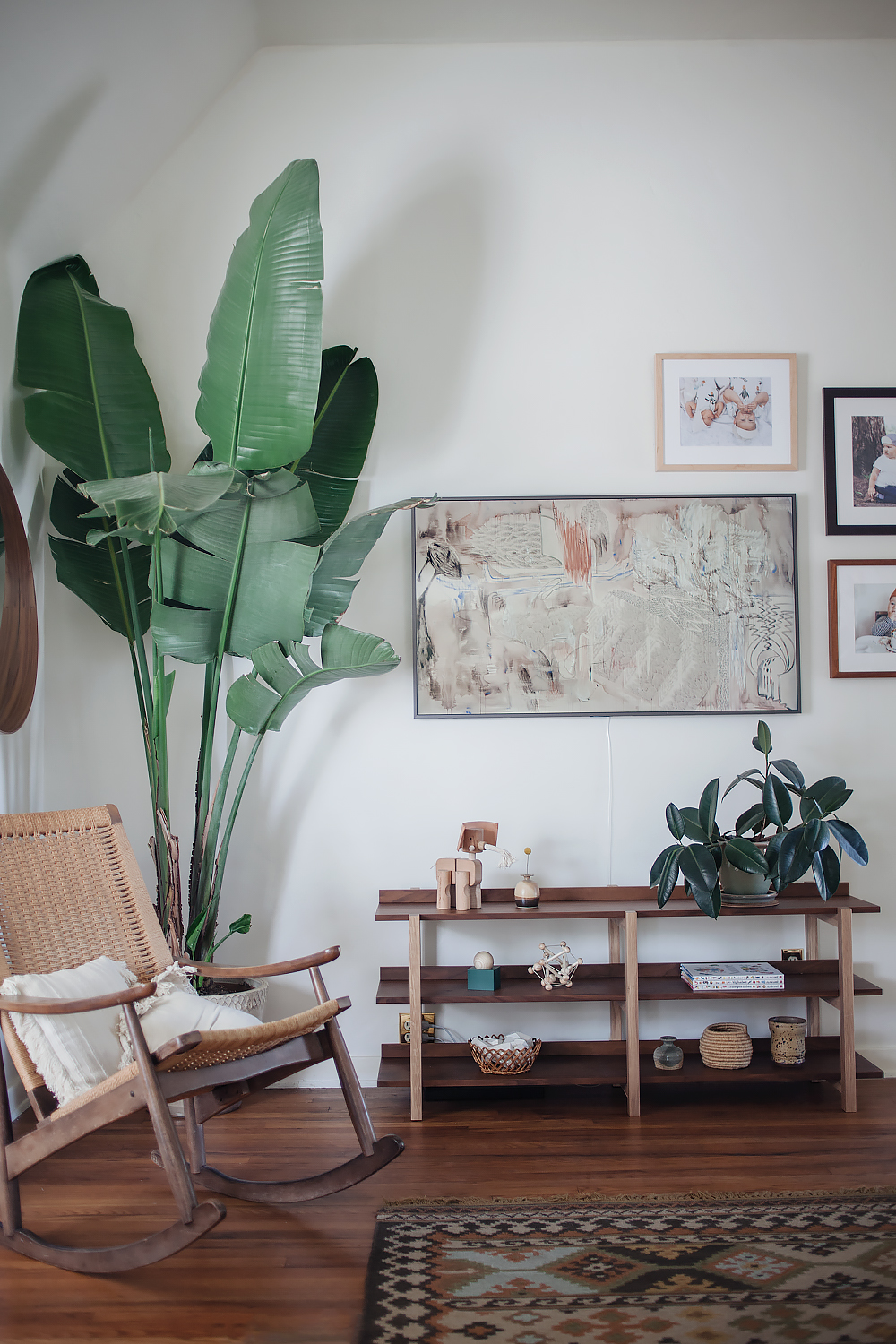
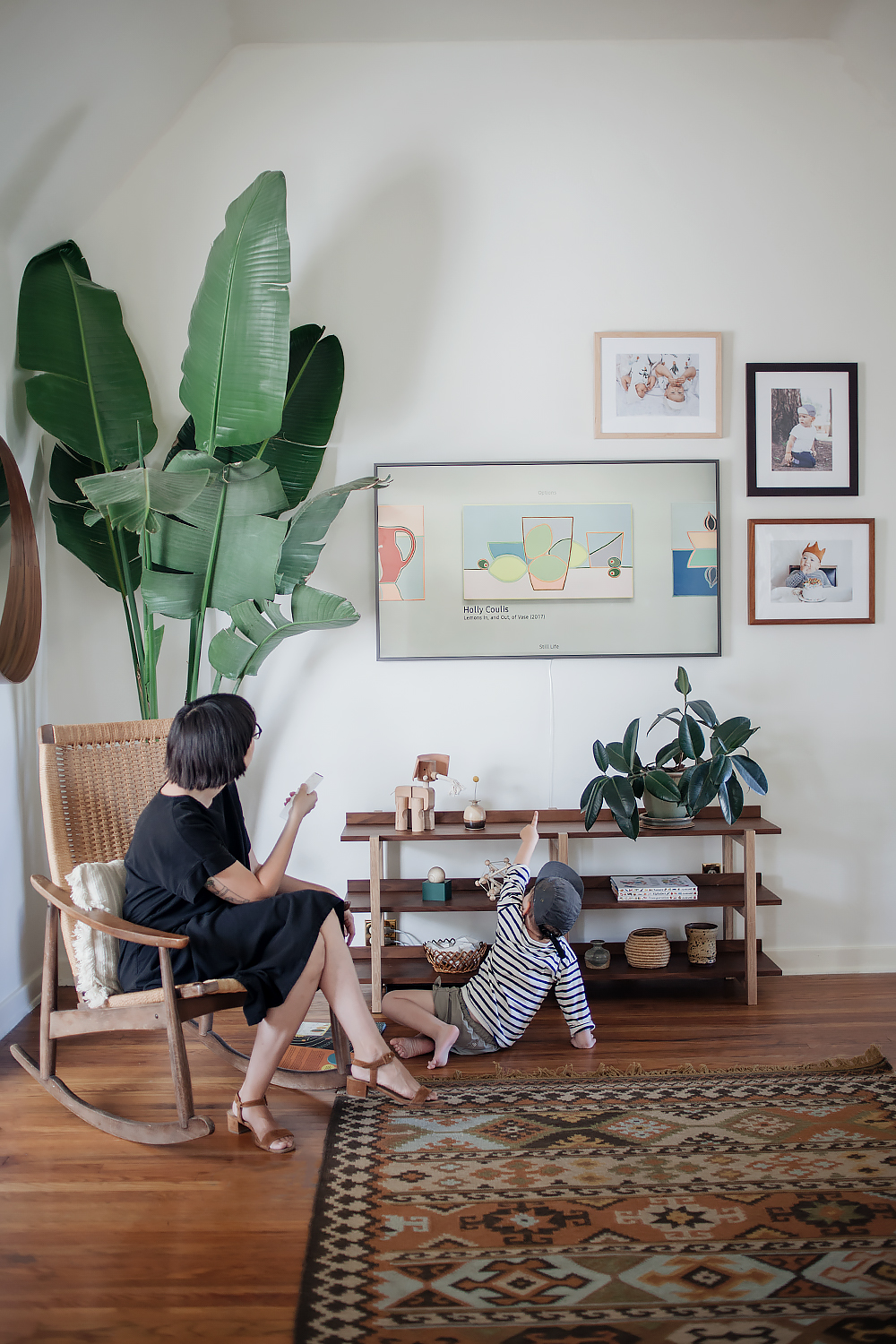
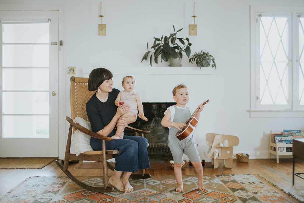
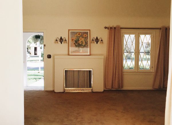
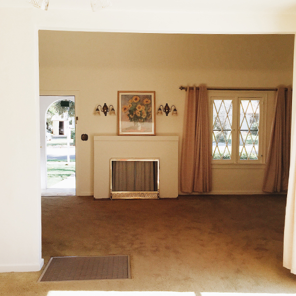
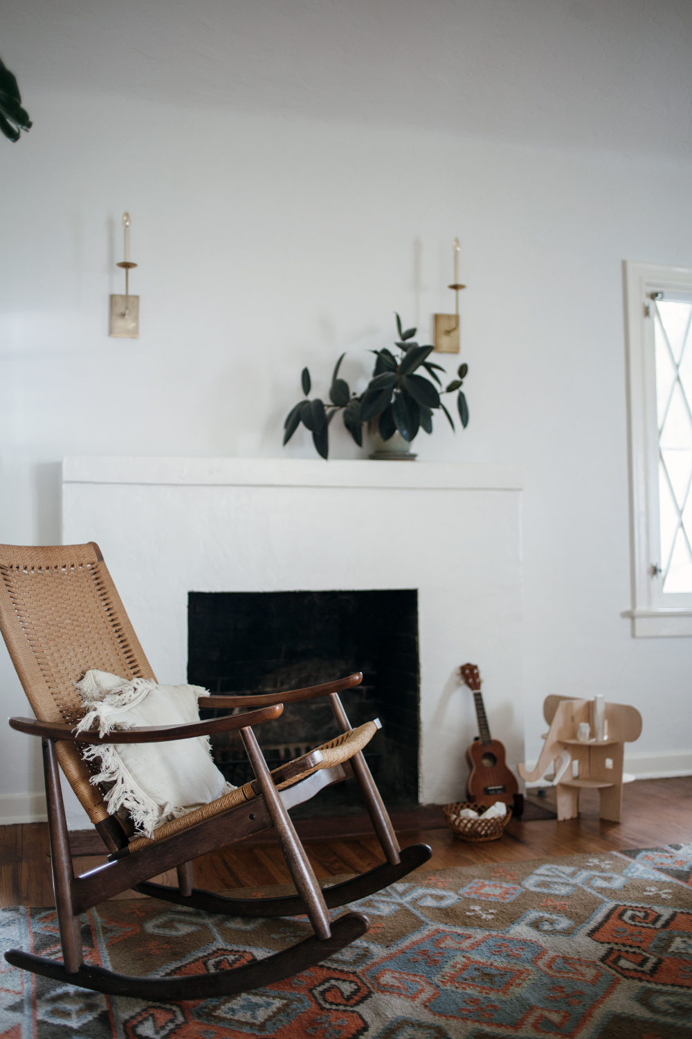
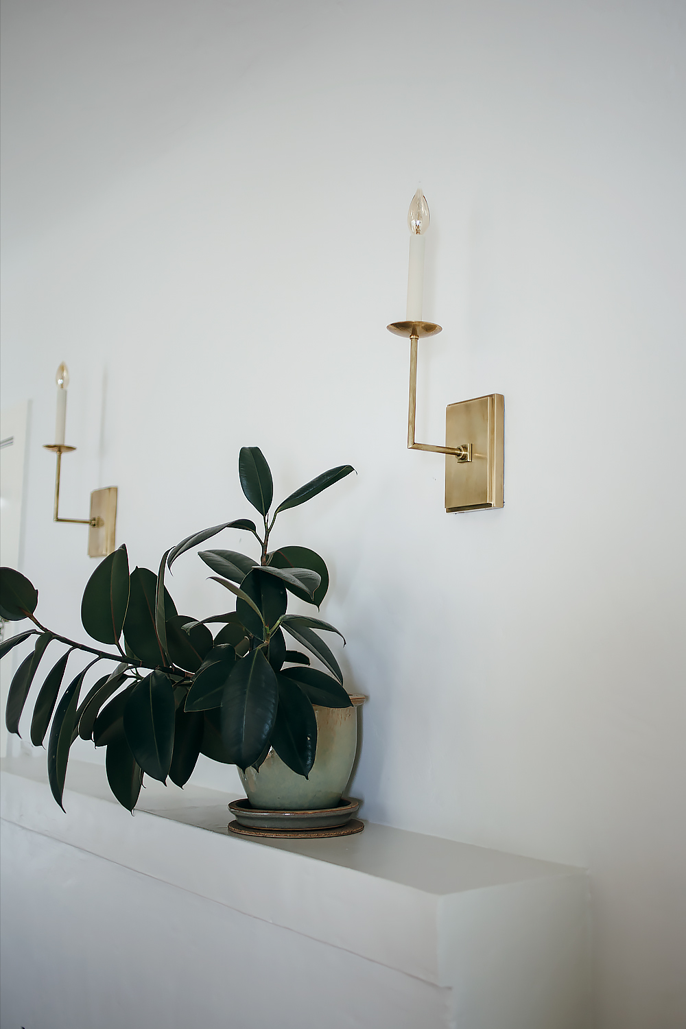
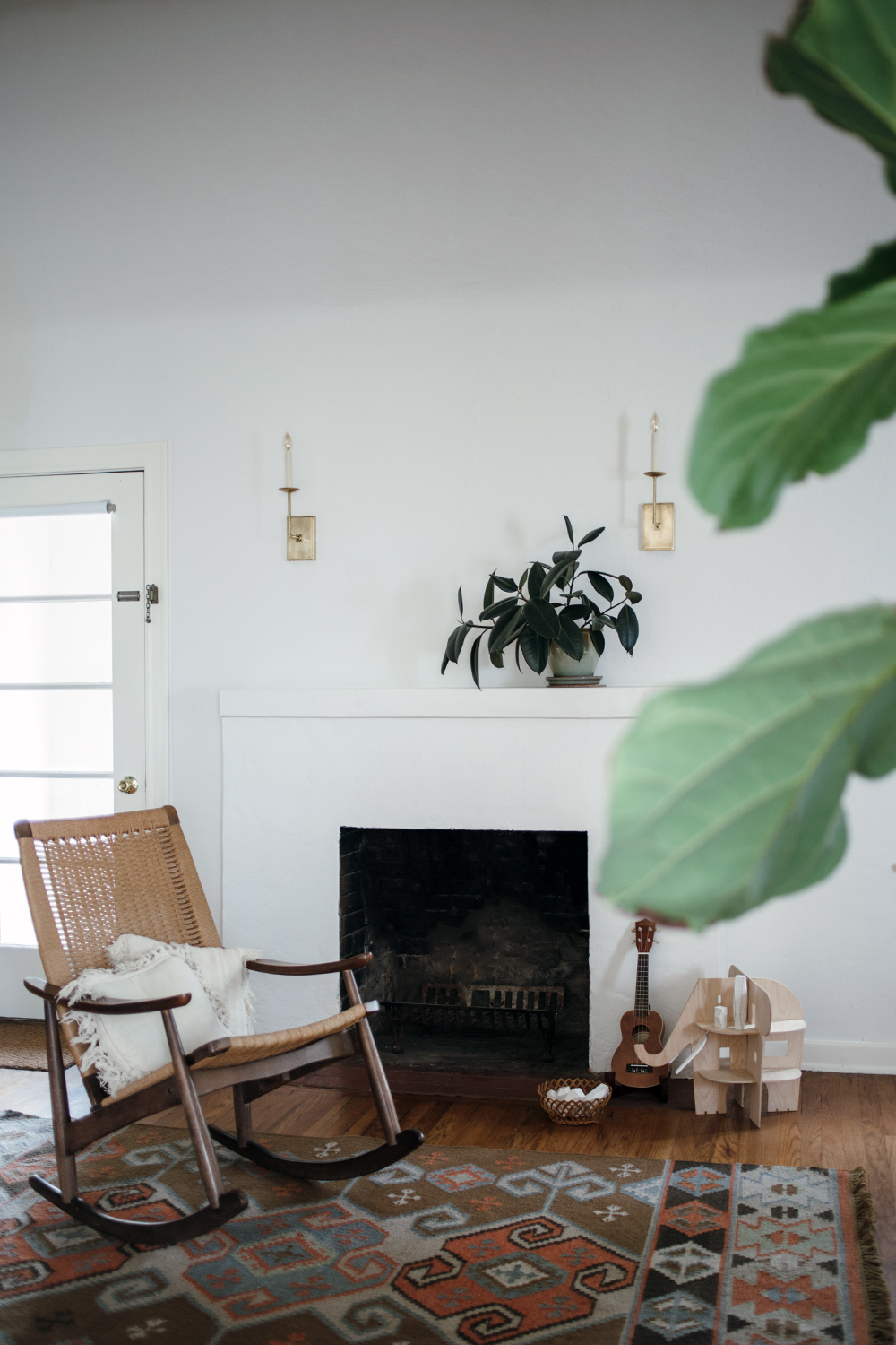
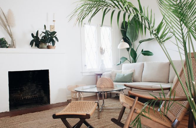
it started with the fireplace makeover. then i decided to rethink the entryway. then i decided to build some walls and finally finish this living room! the previous owners of the house made the interesting choice of removing a few crucial walls from the living room to create a more open space. don’t get me wrong, i love open spaces, but this little house was built in 1927 when open concept wasn’t a thing. the lack of wall space was making it really hard for me to pull things together. there was a wall removed between the living room and a tiny side patio/sunroom. in the process, they also removed an exterior door and window from the patio, essentially expanding the size of the living room, but in the most awkward way possible! there was basically a little cave on one end of my living room that i never knew exactly what to do with it. you can see what i’m talking about here. we finally built the wall and it really did change everything. it feels so much more like a proper living room now. that wall (and another once which i’ll share soon) were the missing pieces in the puzzle that have finally brought this room together to really make our house feel like a home.

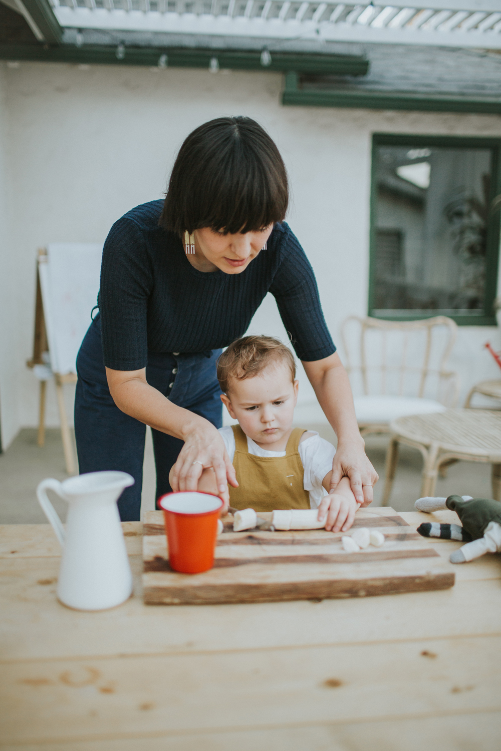
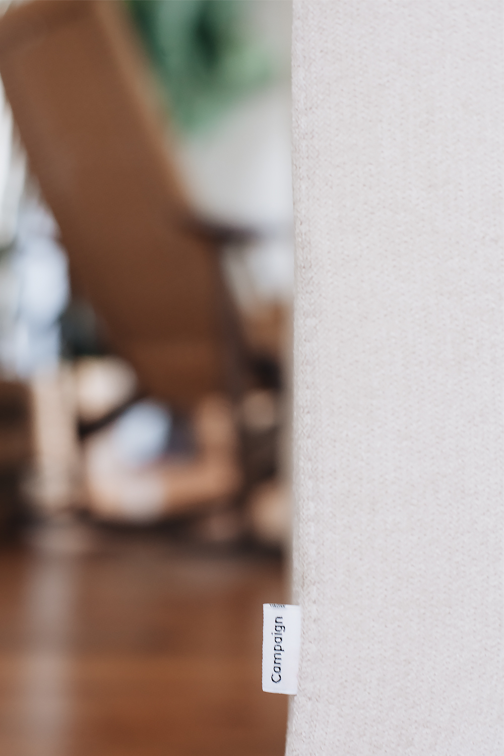
so when campaign first got in touch with me about their new line of furniture, i was ridiculously excited because my previous sofa did not age well. don’t get me wrong, i loved that green sofa– for the first couple of years. but over time, the textile started getting snags and pulls, and no amount of scrubbing was going to remove some of those kid stains. it just got sad. i started adding ever more throws and pillows in an attempt to cover things up. the time had come.

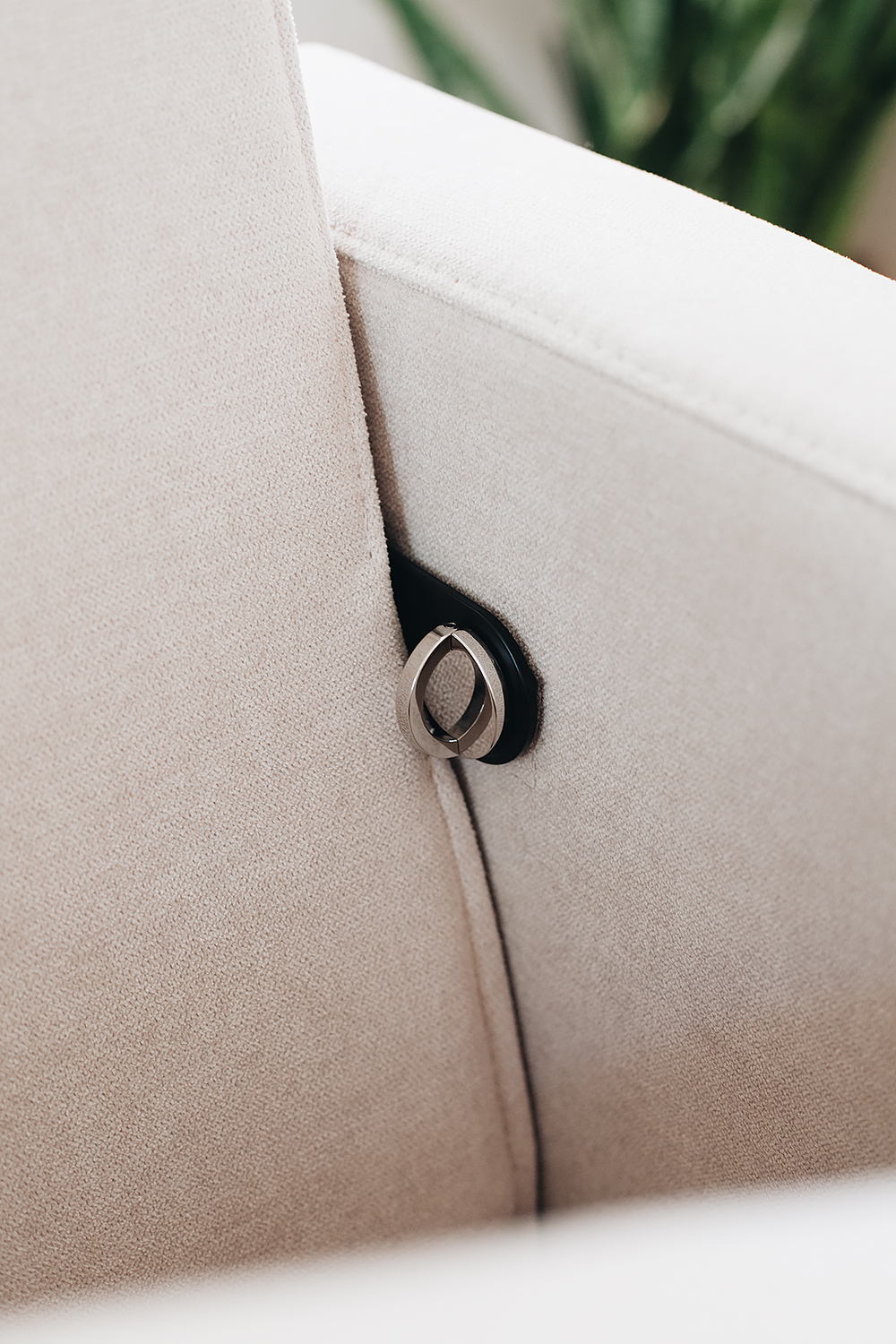
but of course, i was tentative about a new sofa because it felt like such a commitment, and i was worried that it would meet the same demise as my previous one. the kids really know how to destroy a piece of furniture. and what about the color? how could i commit when they have so many options? but as i started to explore the brand, all of my worries subsided. the whole concept is really interesting and definitely nothing i’d ever heard of before. not that i know a lot about furniture, but i had never seen a sofa built with a steel frame. the idea is that the entire thing can be assembled at home and disassembled for portability when it’s time to move. which means that all of the upholstery– the back, the arms, all of the pillows– can be completely removed and tossed into the wash, or even completely replaced! and the steel frame is basically indestructible. you can even choose from two different wood tones for the legs. and did i mention that their prices range from $595 – $1,195? done deal.

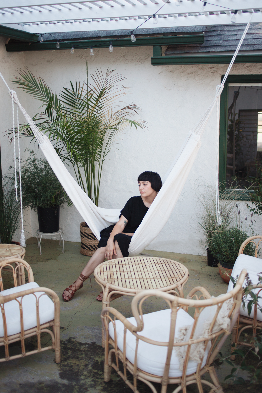
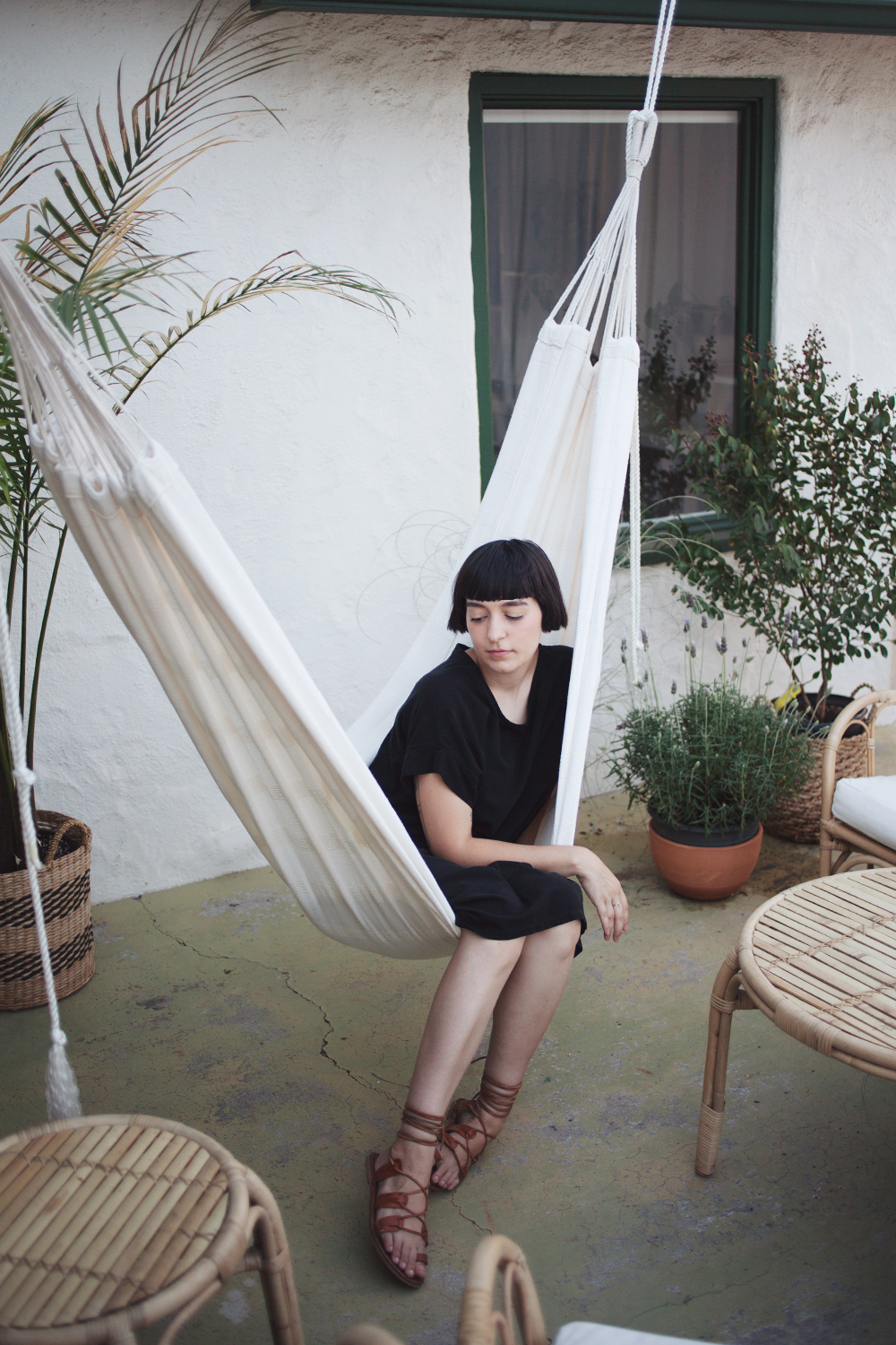
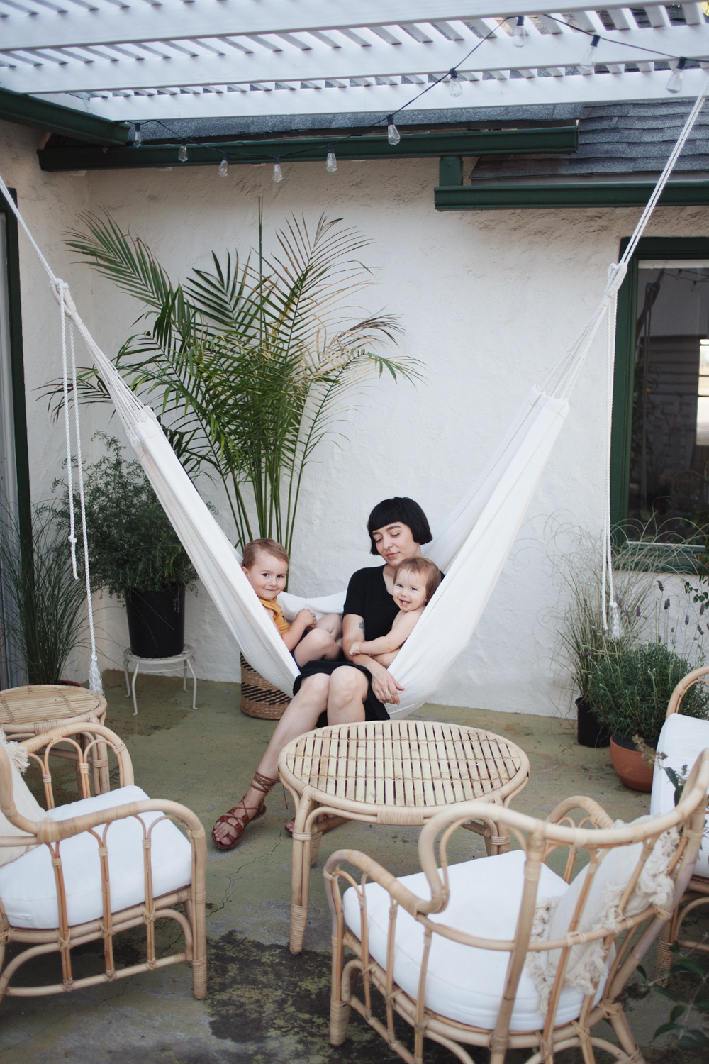
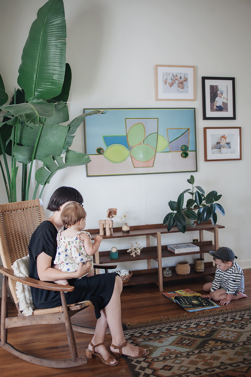
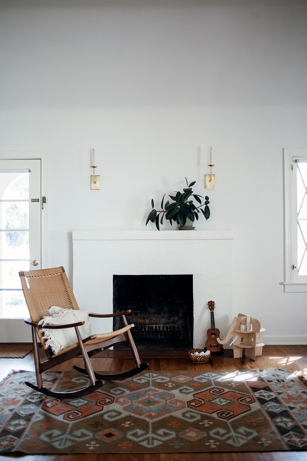
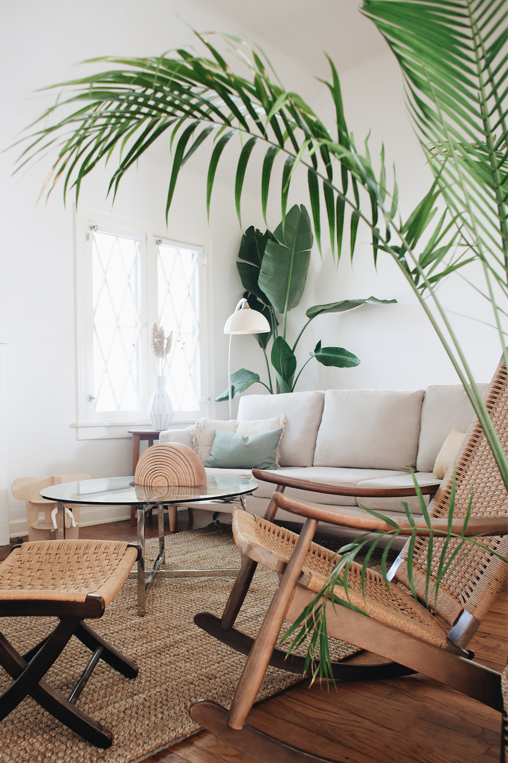
in terms of the room, i’m still in the process of decorating things, but this is what i’m calling the baseline. we got the sofa in almond white. i chose really neutral pieces in different tones of wood, glass, metal, and natural fibers as the foundation because i wanted something really flexible that would allow me to change the decor without having to buy completely new furniture every time i’m in the mood for a change. because if you’ve been following my home decorating journey, you’ll know that i change things around here a lot! with the furniture i’ve chosen, i feel like i can play around a lot with different artwork, throw pillows, different plants, maybe layering a more colorful rug. all things that can be done easily without a complete overhaul. it’s such a calm, relaxing space now, and i can’t wait to play around with it even more!

shop campaign and use promo code ‘CAMPAIGNEH’ for $50 off your first purchase!

calivintage x campaign furniture

calivintage x campaign furniture

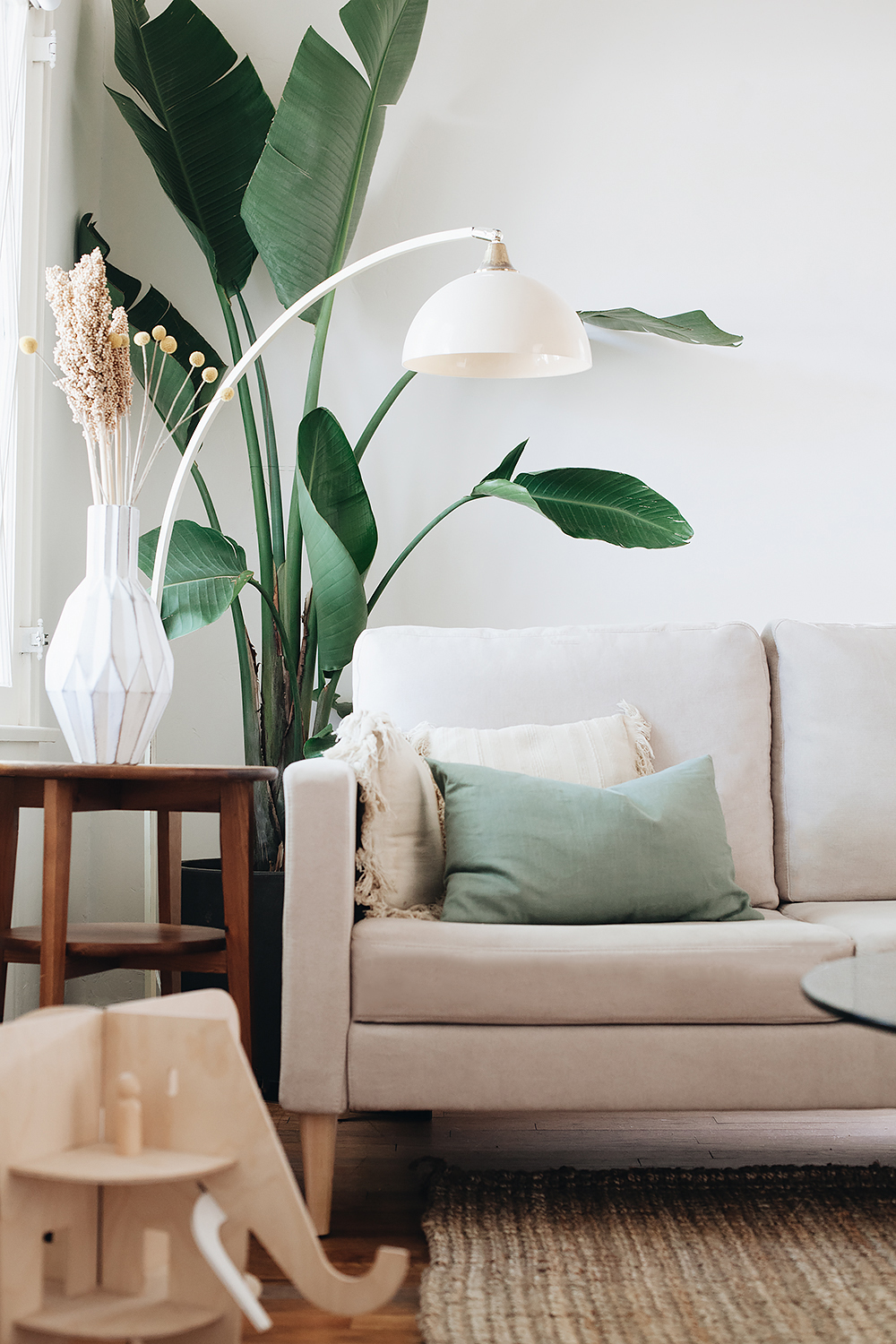
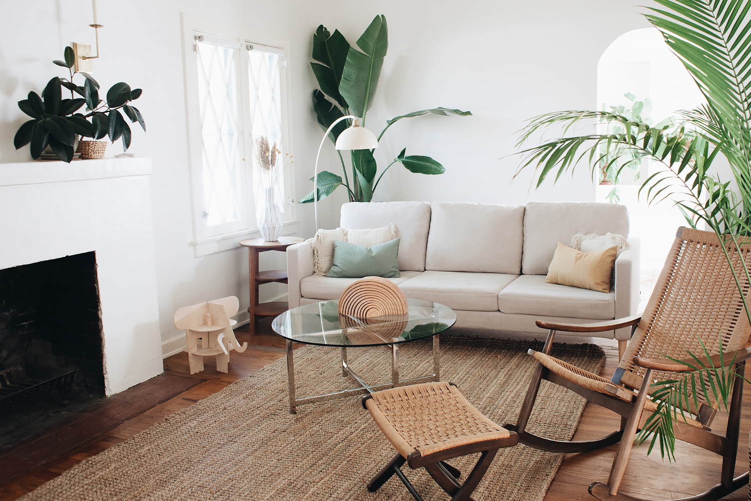
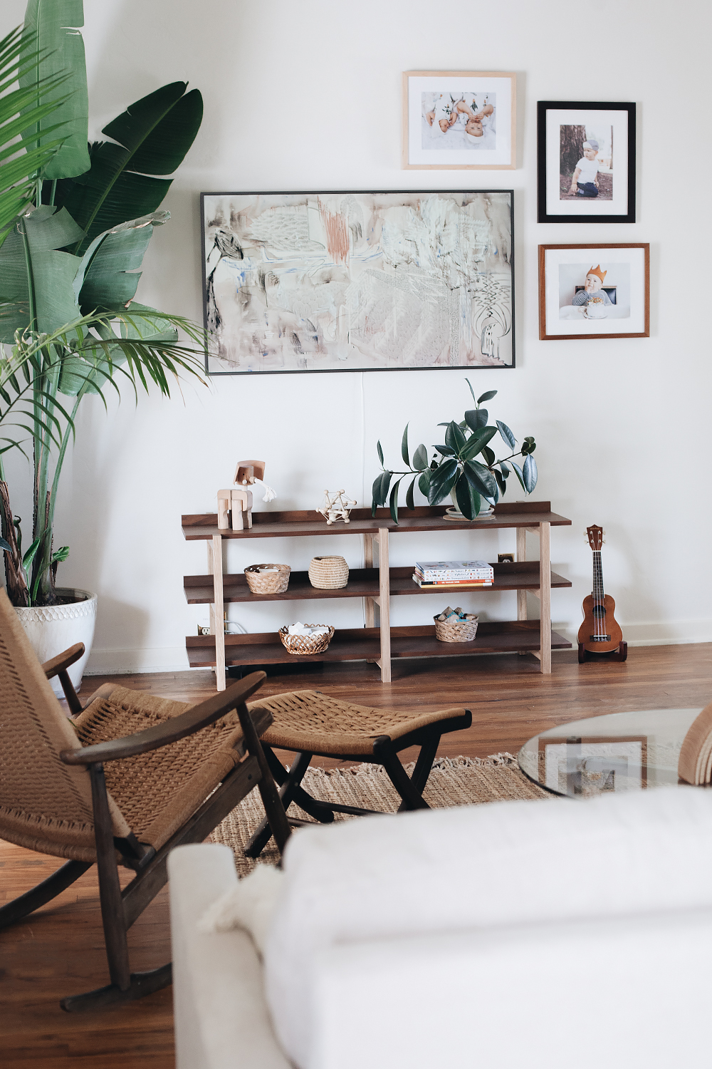
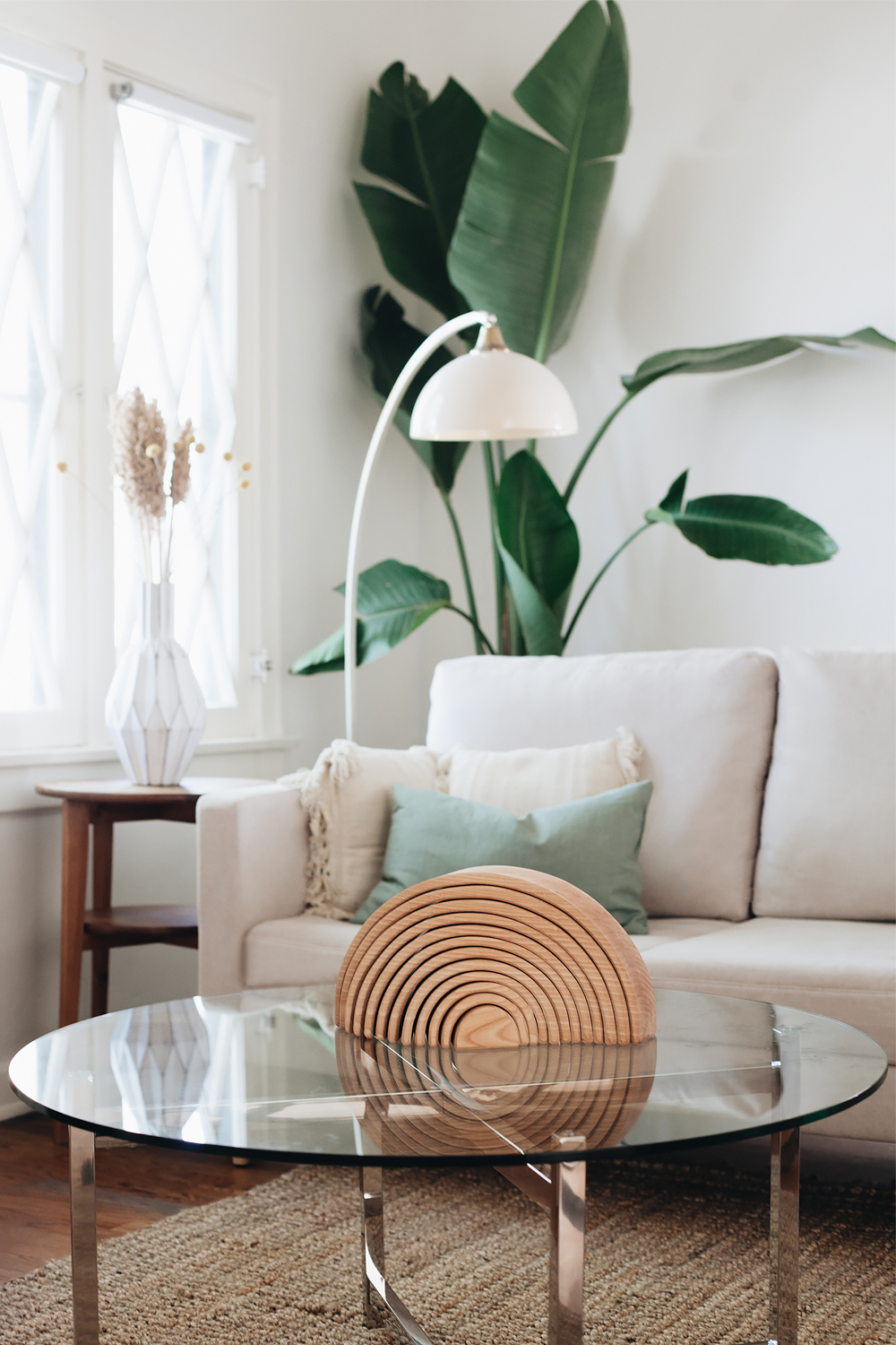
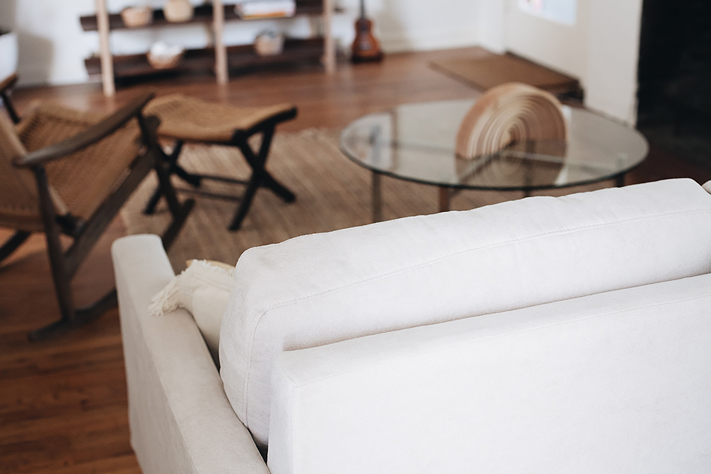
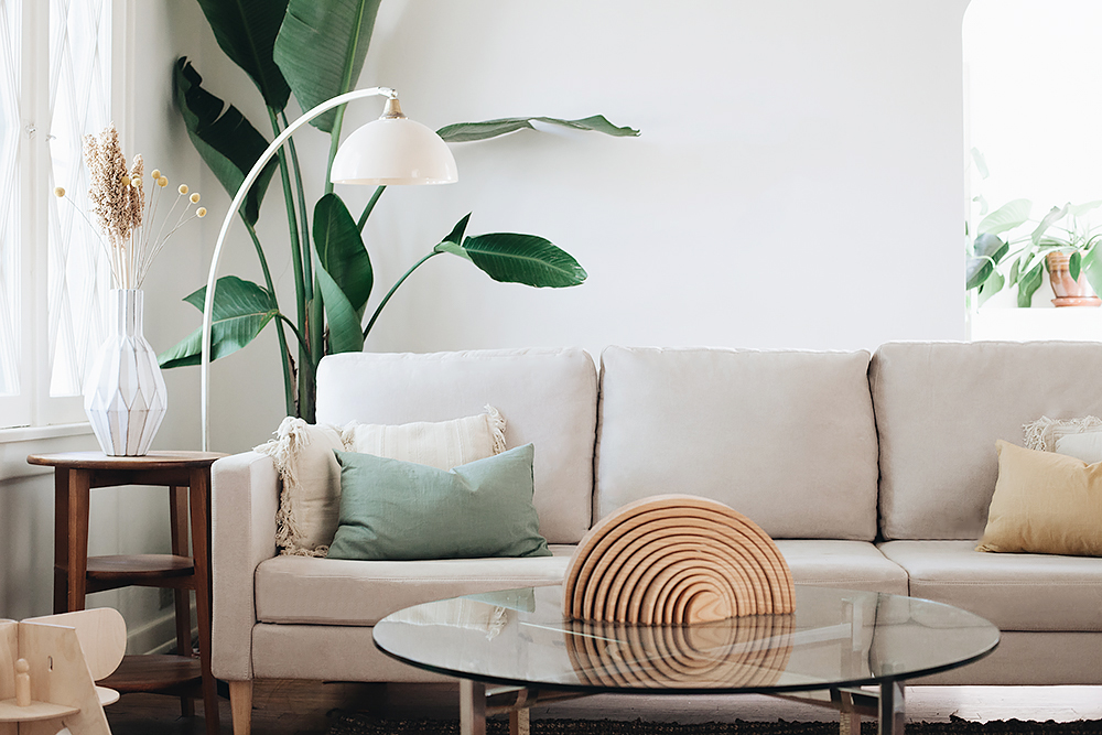
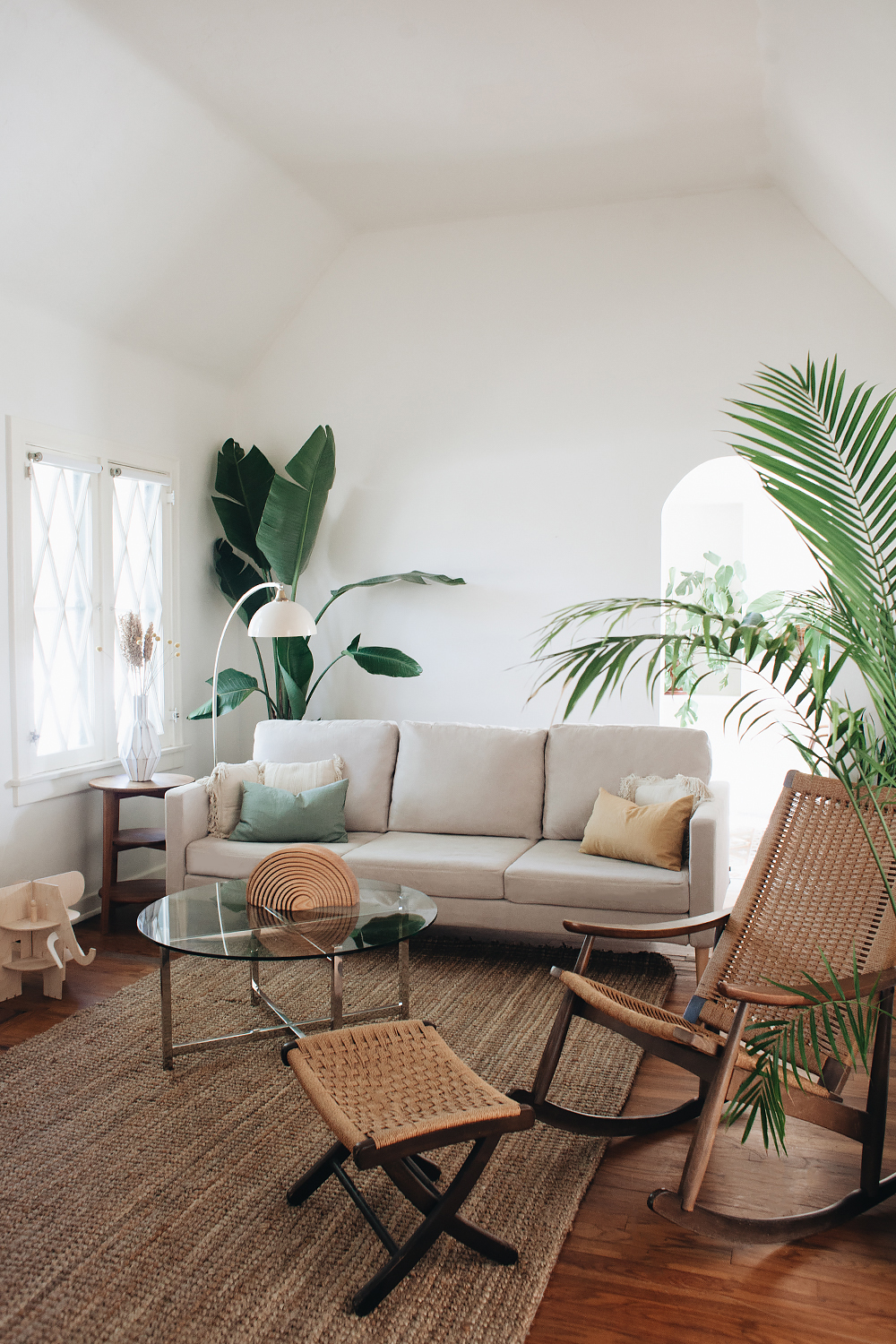
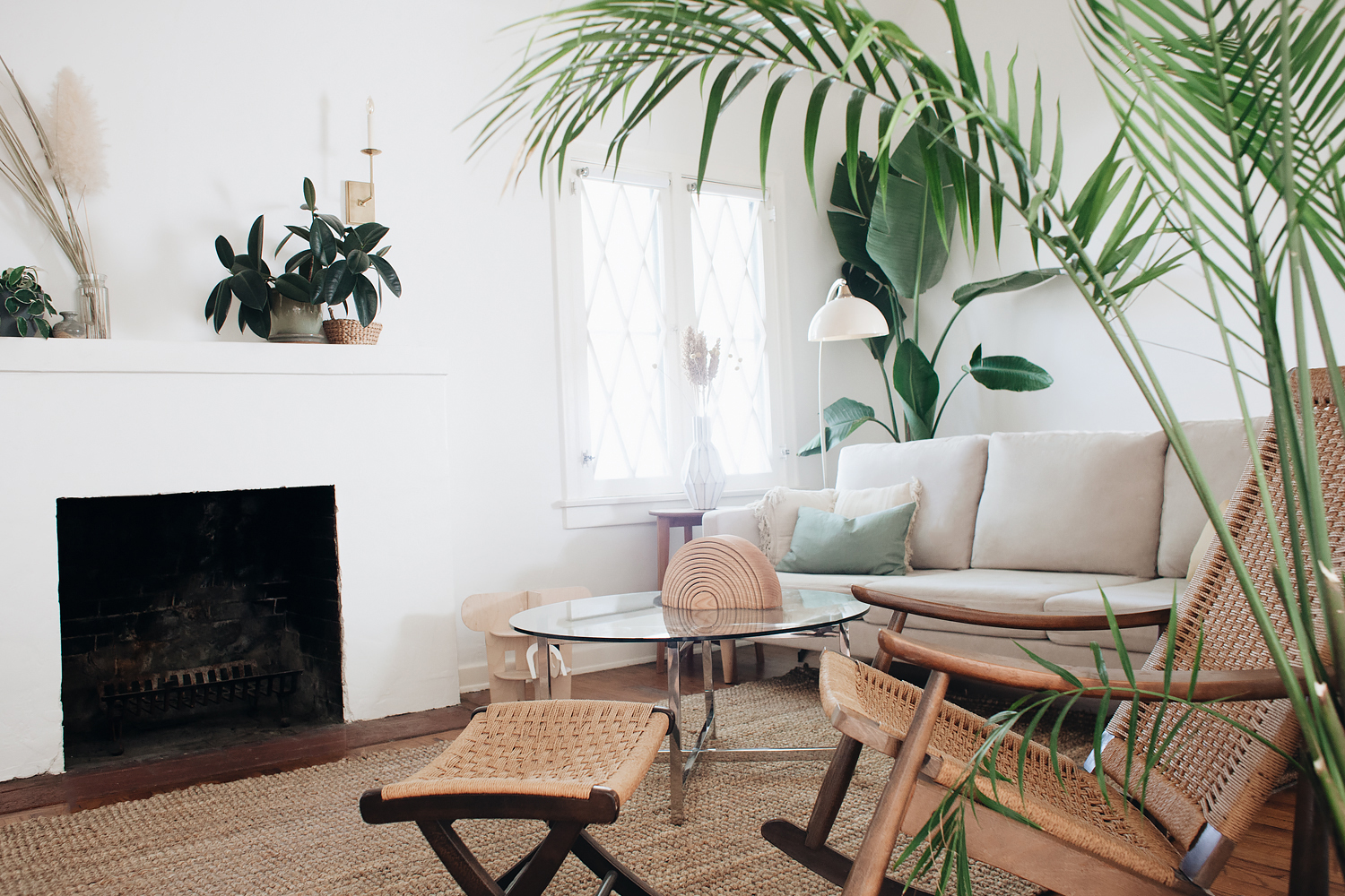
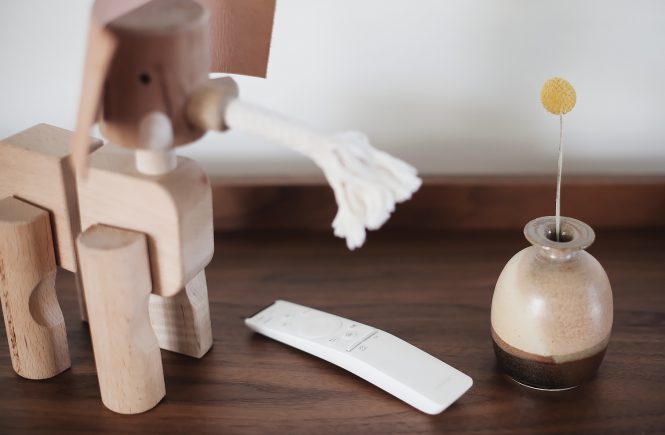
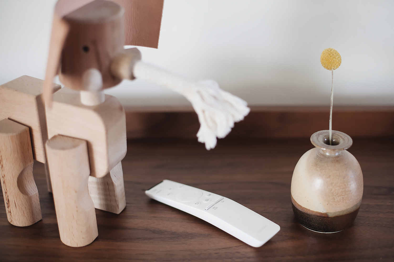
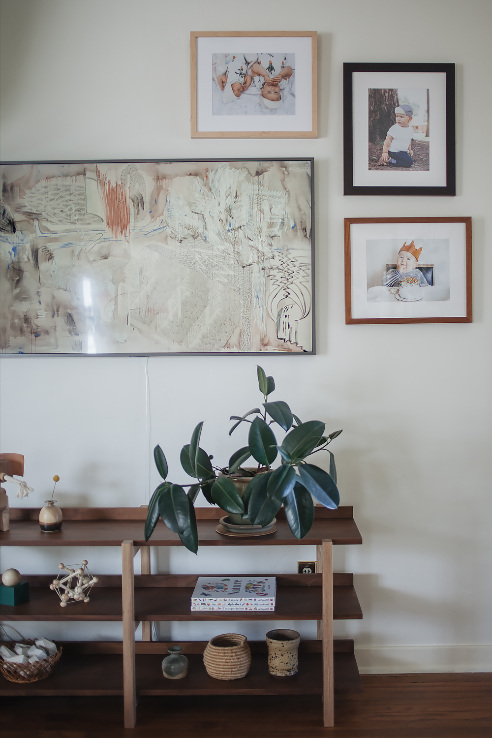
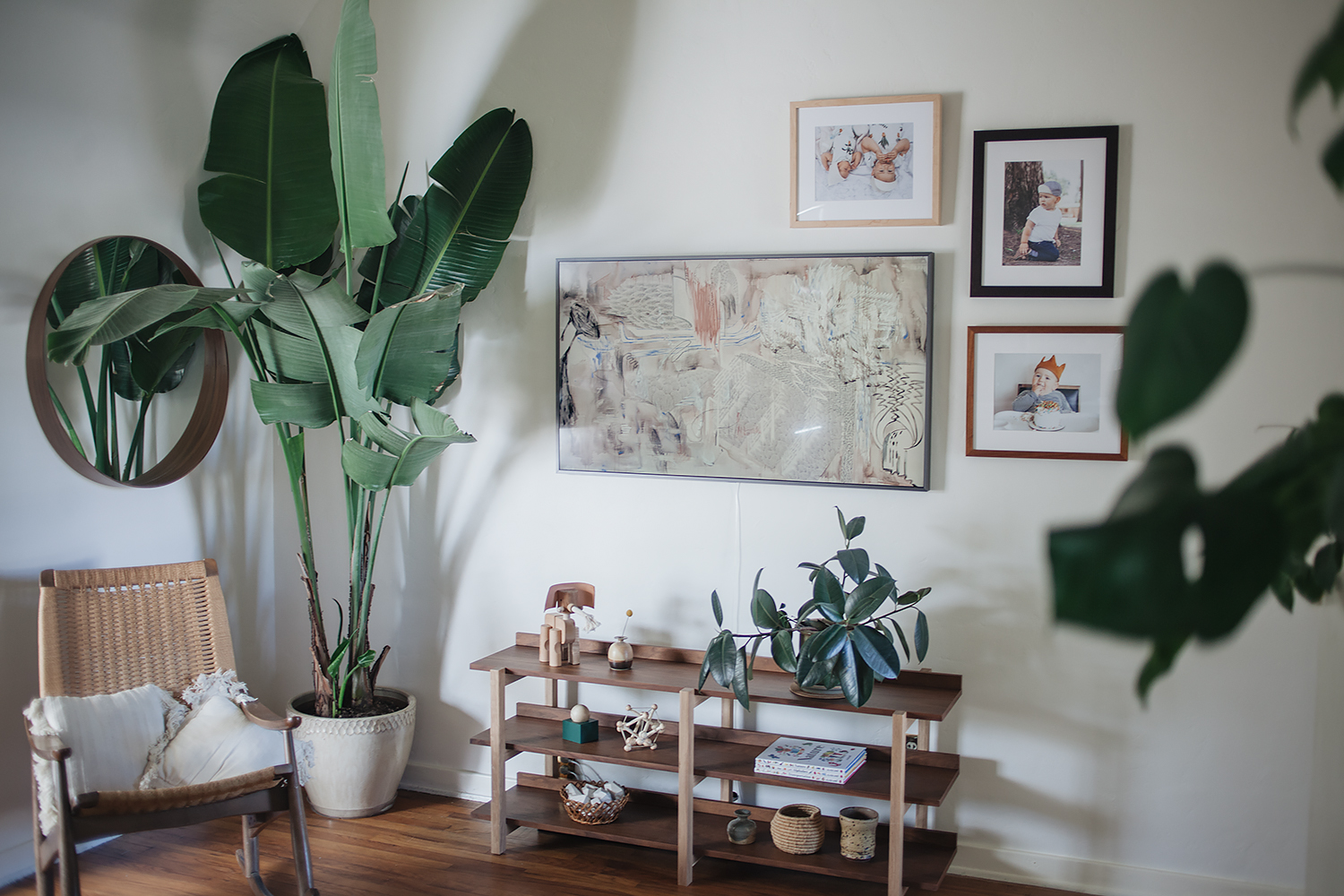
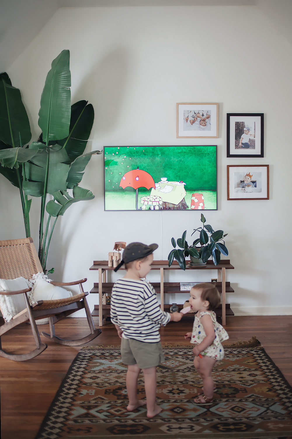
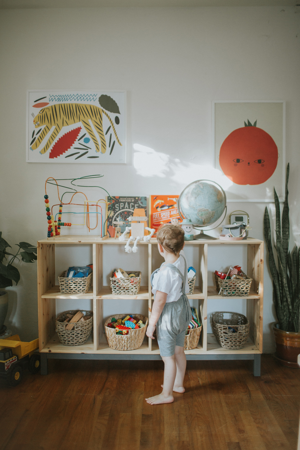
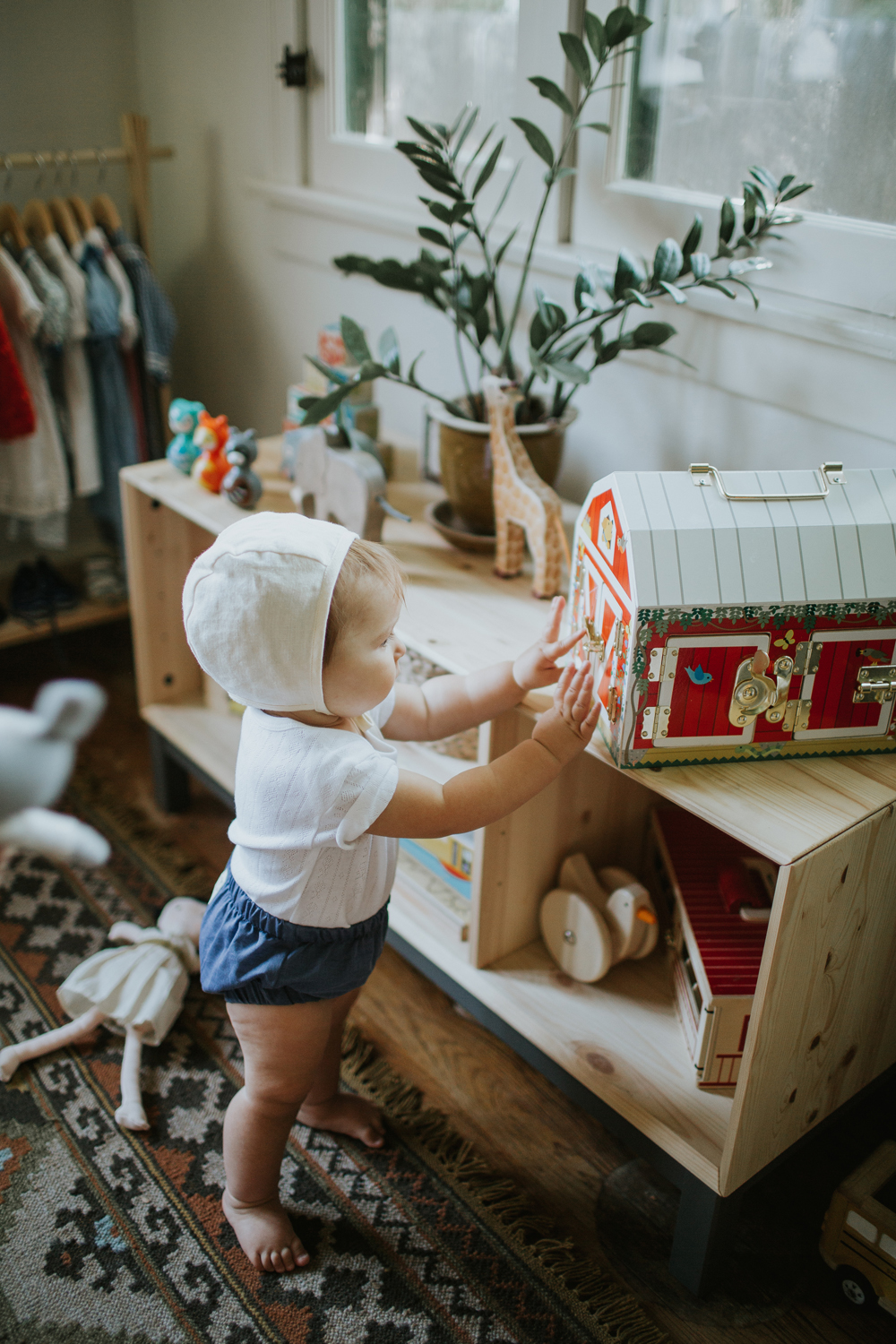
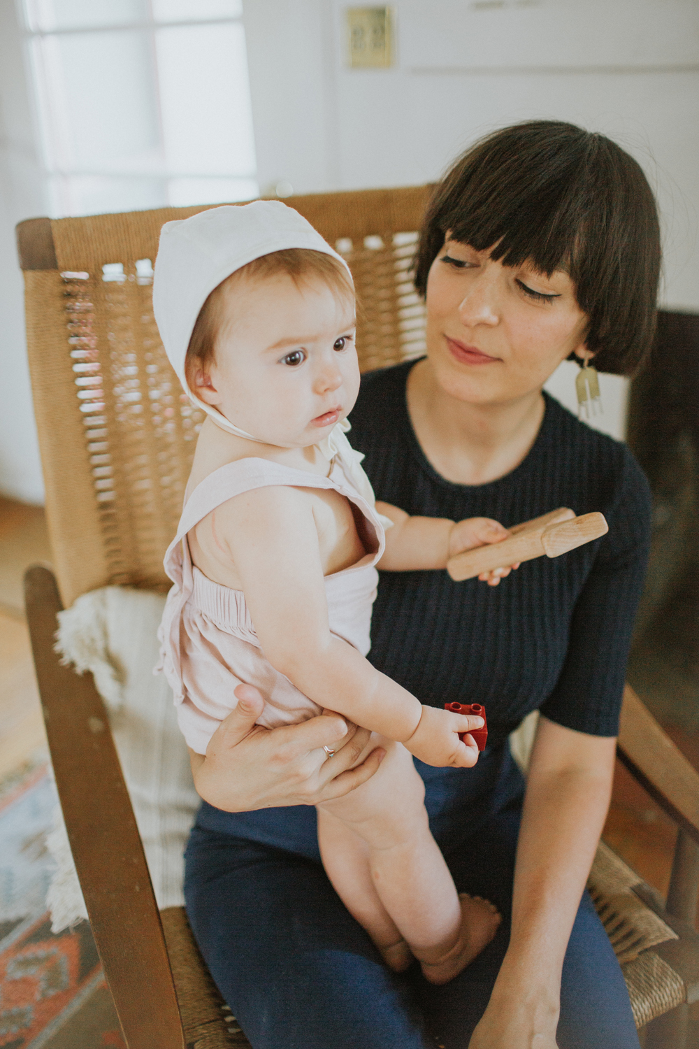
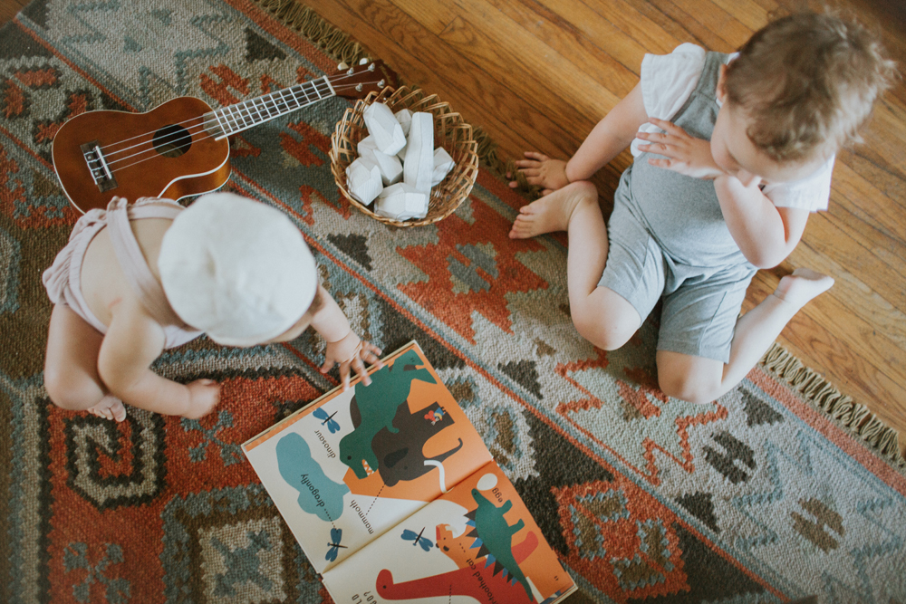
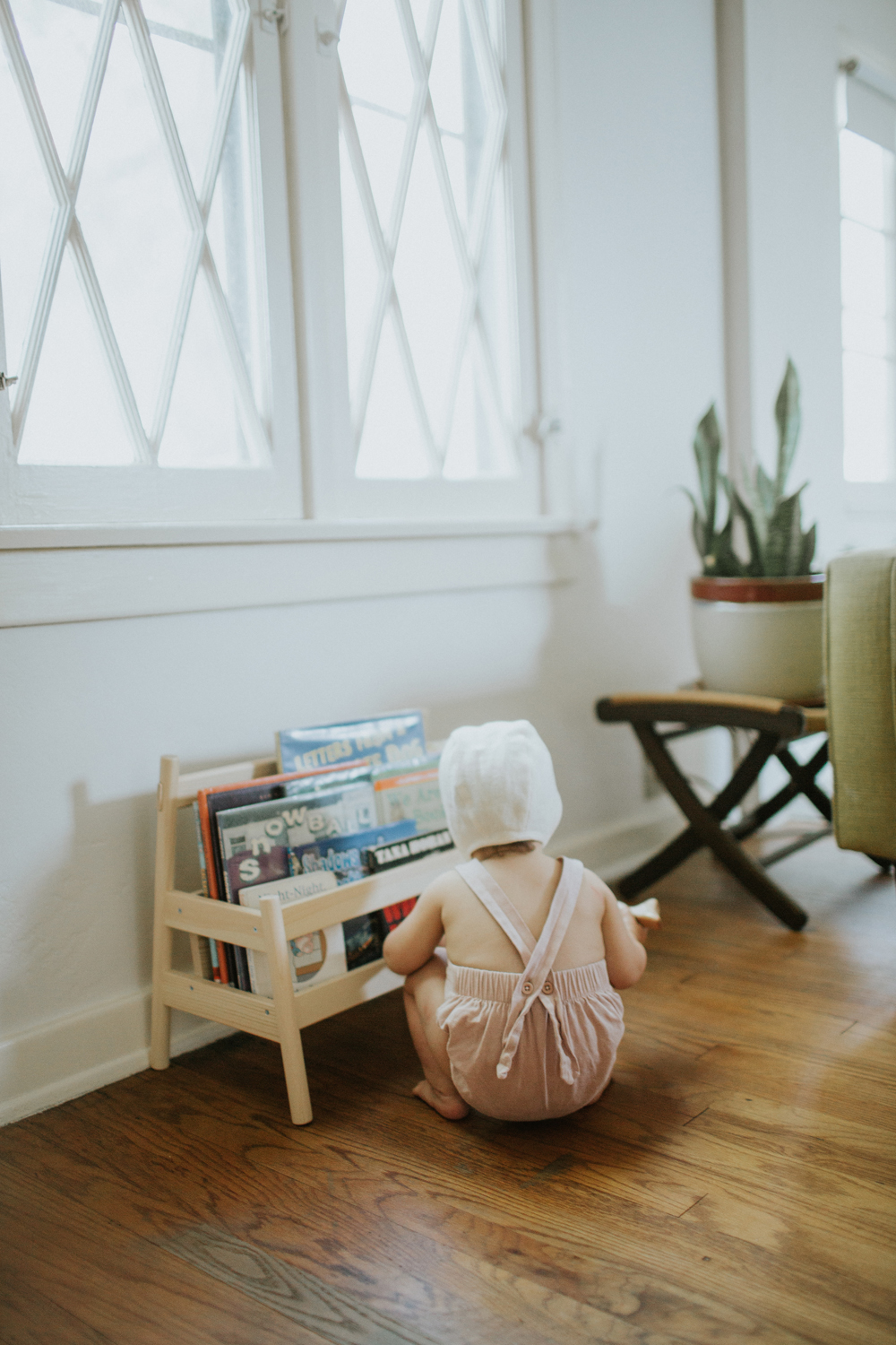
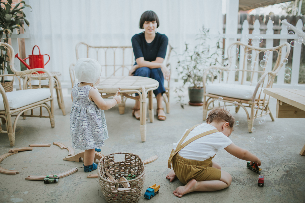
In the house: Campaign Sofa in Almond White, coffee table, Coxwain Hand-Woven Rug with Eco Plush Felt Rug Pad, vintage rocking chair found on Apartment Therapy Marketplace, vintage and handmade throw pillows, Grimm’s Large Wooden Stacking Rainbow (here is a link the smaller 6-piece version), vintage lamp, painting by adam, vintage end table, Rock and Pebble Ele Villavase found on Fab no longer available (but here is one very similar). Feel free to ask me about anything you see in the room that I may not have mentioned here!

outfit: simple summer

there probably aren’t too many people who will agree with me on this one, but i think the summer might be my favorite time of year. i probably complain too much about the heat, but i live for bbqs, chips and salsa, ice cream, and beer haha. i haven’t had a summer vacation in ages, but i still feel like celebrating all of the time. lately, i’m always stopping in for milkshakes at the local burger joint. and i’ve been doing a lot of weekend taco parties with a few too many margaritas. and getting dressed is so easy. you can’t really wear too much because it’s too darn hot, which is kind of liberating. i mentioned lots of white tops and blue jeans in my post yesterday– well here it is! my summer uniform. although i have to say, these intentionally blank crystal heels in blood orange are kinda stealing the show. the perfect pop of color, as they say in the fashion industry.

wearing:
vintage blouse
steven alan bryce sunglasses in peach crystal
rachel comey slim legion jeans <—get $20 off your first order when you sign up with this link!
intentionally blank crystal heels in blood orange
doen market carry all basket


summer denim

calivintage - mr. larkin summer denim

though i may not always share the photos on my blog, i have always been obsessed with finding the perfect pair of jeans. for years, i was a j brand devotee. then i had two kids and kinda gave up on denim because my size was fluctuating so much. but now that things are leveling off again, i’ve started searching high and low for the best vintage and vintage-inspired jeans. most days, all i want to wear is a white blouse of some sort with the perfect pair of jeans. i should really post those photos somewhere as proof, but instead, i’m going to share this editorial by mr. larkin that sums it up better than i ever could. i love everything that they do!

i recently purchased my first couple pairs of re/done levis after having coveted them for years. i was really anxious about it because of the price tag, but the fit really is as good as the claims. so far, i have a pair of the ultra high rise and the high rise crop flare, which i promise i will photograph and share more about soon!

and i’ve been a fan of the classic jesse kamm sailor pants for quite a while, so i was really excited when she came out with a pair in 12.5 oz. american denim. i just ordered a pair and can’t wait for them to get here!

also wouldn’t mind trying out b sides, which are featured in this editorial, along with all of the other jeans in the photographs. they’re another brand doing reconstructed vintage jeans and they have a really cute wide leg style i’ve got my eye on!

of course, vintage levis (and wranglers and lee jeans) are also a great and inexpensive option, but i really love a super high rise, so it’s been harder for me to find a pair that fits just the way i want. i’m toying with the idea of getting my tailor to make some alterations to a pair of vintage jeans… we’ll have to see.

calivintage - mr. larkin summer denim

outfit: lo & sons

when it comes to clothes, i feel like i pretty much know my taste. i know what i like and what i don’t like, and i tend to have a pretty intentional wardrobe with clothes that are classic, versatile, and a little bit interesting. i have a formula that works for me, and i’m pretty happy with it. but when it comes to handbags, i’ve been having the hardest time figuring out what i really want. i guess that probably seems silly, but i can never seem to commit to any particular style, so i’ve been putting off buying a new handbag for ages, and just stick with the same old, same old. so i was really thankful when lo & sons helped pull me out of my rut with this new handbag. designed with travel in mind, they created a small handbag that can be worn four different ways to suit your many different needs: as a classic crossbody, a shoulder bag, a clutch, or a belt bag.

pretty much perfect for my indecisiveness about handbags, don’t you think? i particularly like wearing is as a crossbody or belt bag, but you can see all of the different iterations in the photos. and it comes in black with gold or silver-toned hardware, grey, and sienna leather as seen in my photos.

shop the waverley now!

wearing:
the waverley convertible leather crossbody & belt bag courtesy of lo & sons
power of my people linen shirt
jesse kamm pants in cunningham blue (this color has sold out, but them come in lots of other shades)
mari giudicelli leblon mules
steven alan bryce sunglasses in peach crystal


outfit: seeing double

calivintage + hackwith design house hdh basics plus

it’s been a little while, but my sister erica is finally making another appearance on the blog! it took a bit of coercing on my part, but i was really excited to do this shoot with her to talk about hackwith design housethey recently updated their hdh basics line to include even more of their classic styles in a larger range of sizes from xs to 4x. a common complaint that my sister has is that plus sized clothing offerings aren’t the same as the cute stuff you find in straight sizes. i know it’s not easy, but if more brands would hire multiple fit models, they could scale their sizing up or down to fit a broader range of people, so that everyone can enjoy the same garments instead of being relegated to only one section of a shop.

case in point: we were both able to get this easy wide leg jumper and be twinsies haha. no, we don’t match like this every day, but it is great that no matter who asks us where we got our jumpsuit, we know that they can go online and find it in their size. and that’s exactly how it should be!

i’m wearing: hackwith design house wide leg jumper, vintage blouse, vintage handbag, maryam nassir zadeh sophie sandals, steven alan bryce sunglasses in peach crystal

erica is wearing: hackwith design house wide leg jumpereasy kimono in white, pons avarcas, clare v. petite kenya bagg-star raw caramel crystalline sunglasses

calivintage + hackwith design house hdh basics plus

someware goods giveaway!

two exciting things today: 1. i’m sharing another little peek at the progress i’ve made on my patio, and 2. i’m giving away one of these beautiful hammocks from someware! if you’re not familiar, they’re an online shop based in los angeles featuring beautifully curated items for the home, handcrafted by artisans and designers from around the world. in addition to paying fair wages for these expertley crafted handmade goods, they also donate a portion of profits to live simply 4 peru.

i’ve been a fan of the shop for quite a while because they have such a great selection of woven baskets and beautiful textiles. this hammock was the perfect addition to the patio as i continue to spruce things up in our little outdoor living area. the hammocks have since sold out, but someware set one aside specifically for one lucky winner of our giveaway!

to enter, visit this post on instagram!

and get 20% off your purchase at someware with code ‘calivintage’ now through sunday, july 23rd!


the frame

you may remember a few weeks back, we started the process of redecorating our living room. the whole space got a fresh coat of paint and i started simple with a fireplace makeover. but one thing i forgot to mention is that we completely removed our old television from above the mantle because we just couldn’t figure out a way to make it work in our tiny living room. don’t get me wrong, i like to watch tv as much as the next person, but i don’t really like the way it takes up so much space and has a tendency to become this dominating presence in the room. add in the fact that we don’t have a ton of wall space– and tastefully decorating a functional living room for the family has become a really tricky endeavor.

enter samsung’s latest collaboration with designer yves bÁ©har– the frame. we received this innovative new tv in collaboration with samsung, and i didn’t even know what i was missing before it arrived! you may remember that previously, this wall served as a sort of makeshift foyer (see here and here). our current patio/mudroom is out of commission due to renovations (which is an entirely different story that i’ll have to save for another day!), so we’ve been sacrificing a big part of our living room as a place to store our shoes and drop off the mail. it was cutting the room in half and was creating a lot of wasted space in an already cramped area of the house. after changing things up, i can honestly say that without the frame, there is literally no other way we could have made a television work in here so gracefully.

true to it’s slogan, it is literally the most beautiful tv you’ve never seen. if i hadn’t taken these photos myself, at first glance, i don’t even think i would have known it was a television. the beauty is in the super sleek design coupled with the no gap wall mount so that it hangs flush with the wall alongside all of your favorite framed photos or artwork. the invisible connection is virtually undetectable and eliminates the usual mess of cables so that it truly looks like framed art on display. when you’re not watching your favorite shows, you can leave it in ‘art mode,’ allowing you to select your favorite art from a gallery of 100 professionally curated pieces of art. or you can upload your favorite family photos, it’s up to you. if the black frame isn’t your thing, you can also customize it with three additional bezel options in light wood, walnut, or white metal.

the design is really what sold me because it’s allowed me to ‘hide’ the television in plain view and put it in a place that helps to keep the living room cohesive and functional at the same time, which has totally opened up the possibilities when it comes to the rest of the decor as we continue working on the space. but if you’re more into the technical specs, then you’ll be impressed to know that it is a 4k hdpro tv with four times more pixels than full hd. and it’s no small thing coming in both 55″ and 65″ sizes. it’s like having an art gallery and a secret home theater all wrapped up into one tiny living room. who knew a tv could do so much?

go check out the frame for yourself!

other details: framebridge frames, vintage rocking chair found on apartment therapy marketplace, cb2 stax shelf, monroe workshop toy elephant, vintage baskets, good thing mini container in forest, manhattan toy skwish, areaware balancing blocks, vintage throw pillows, kosas home indoor/outdoor rug (sold out, but this one is similar)


this post was created in collaboration with samsung.


talking montessori with noble carriage

noble carriage interview with calivintage

wanted to stop in today to share that i was interviewed for the noble carriage blog and talked about how we do montessori at home. it’s a bit of a departure from my usual outfit posts and home decor posts, which was a little scary for me at first, but i’m really glad with how the photos came out and i hope you enjoy getting a little glimpse into our daily lives. of course toddler tantrums have been edited out, but other than that, it’s a pretty accurate picture of how we live.

my very talented neighbor yvette came over to shoot the photos, so i decided to share some of my favorite images (including a few that didn’t make the cut), but you should definitely head on over to the blog to read the interview and see the full feature!

noble carriage interview with calivintage

nanushka spring 2017

calivintage - nanushka spring 2017

i know we’re kind of getting midseason over here, but with summer vacation upon us, i’m just getting started! the spring 2017 collection by nanushka has been popping up in my pinterest feed lately, and i love it so much! the brand had never really been on my radar before, but it was started in 2005 by designer sandra sandor and has grown to over 30 countries worldwide. so it’s about time that they caught my attention! all of the collections are designed in budapest and produced in europe.

the latest collection really caught my eye because it has this very fun, touristy vibe to it. it’s playful, yet still sophisticated with lots of interesting and offbeat elements. it’s the type of wardrobe i wish i could pack for my imaginary summer getaway. probably my favorite piece is the woven dana dress above, and i’m also really enjoying the straw hats and wicker handbags for that fun and carefree vibe.

shop nanushka here

Continue Reading

a fireplace before & after with true value

calivintage - a fireplace before & after with true value

another little space in our house is coming together! i never say a project is “finished” because there are always improvements to be made, but i’m feeling pretty good about this transformation. if you take a quick scroll past the text, you’ll see what i mean. that photo down there is what it looked like the day we moved in. dirty brown carpet, heavy drapes, cheesy sconces, hotel room artwork. the fireplace was boarded up with a really hideous screen leaning up against it. when it was on the market, i’m sure some people took one look at this living room and turned right around, but i knew that it was just a matter of cosmetics. all it really took was a couple of days work. we peeled away that dirty carpet to reveal the original 1920s hardwood floors, we switched out the light fixtures, added our own decor, and slapped on a fresh coat of paint.

and today i’ve teamed up with true value to share my experience choosing the perfect shades of white for your home. but before i go too far on the subject, i do need to preface this by saying that it is nearly impossible to photograph white and get an accurate depiction. i tried to get as close of an approximation as possible with these photos, but the only way for you to truly see what these colors look like is to get some samples and paint your walls! it even took me a few different tries mixing different shades of white to land on something that i really loved. so if you’re on the hunt, i’ve done a little bit of the legwork for you.

the walls are my absolute favorite shade of white. it is the true value easy care ultra premium flat interior in swiss coffee. the color was actually first recommended to me by my house painter and it is a standard shade that it available though many different brands. but it is still a standout choice and my personal favorite for my home. it’s a really great neutral white that isn’t too stark and clinical or too dark and yellow. it gives you that perfect scandinavian vibe– a nice soft white that serves as a clean backdrop for your decor. if you’ve ever had trouble with whites looking too blue or too dingy, then this color will be like a breath of fresh air.

it’s not as noticeable in the photos, but for the trim, i went with a slightly warmer shade of white– true value easy care ultra premium satin interior in sand dollar. i was going for more of a traditional look with this choice because i think it goes well with my 1920s home. i like it because it’s a nice creamy vanilla shade that helps to give just a little bit of dimension and depth without jumping out at you or competing with the decor. it just looks like it belongs. i actually had to go through quite a few different shades to land on this one, so i’ll share what i learned: look at the undertones of the shade you’re using! i was just plucking colors from the samples that i thought looked nice. but when i got home, they were either too pink or too yellow. i finally figured out that you can actually look at the undertones of the color formula as a guide to help you find a complimentary color. i took a look at the neutral undertones of swiss coffee and it helped steer me in the direction of the right shade to warm things up just a tad.

then it was just a matter of painting! this was the first time i’ve tried true value paints and i was really impressed with how viscous the formulas are. the ultra premium line just came out, and it is a paint and primer in one, so you can literally just slap on a coat or two and you’re done.

details: true value easy care ultra premium flat interior in swiss coffee on the walls and satin interior in sand dollar on the trim, visual comfort right angle sconces in hand rubbed antique brass, rock & pebble ele villa, areawear balancing blocks, vintage rocking chair and throw pillows, kosas home cosuma indoor outdoor kilim rug

calivintage - a fireplace before & after with true value

This is a sponsored conversation written by me on behalf of True Value. The opinions and text are all mine.