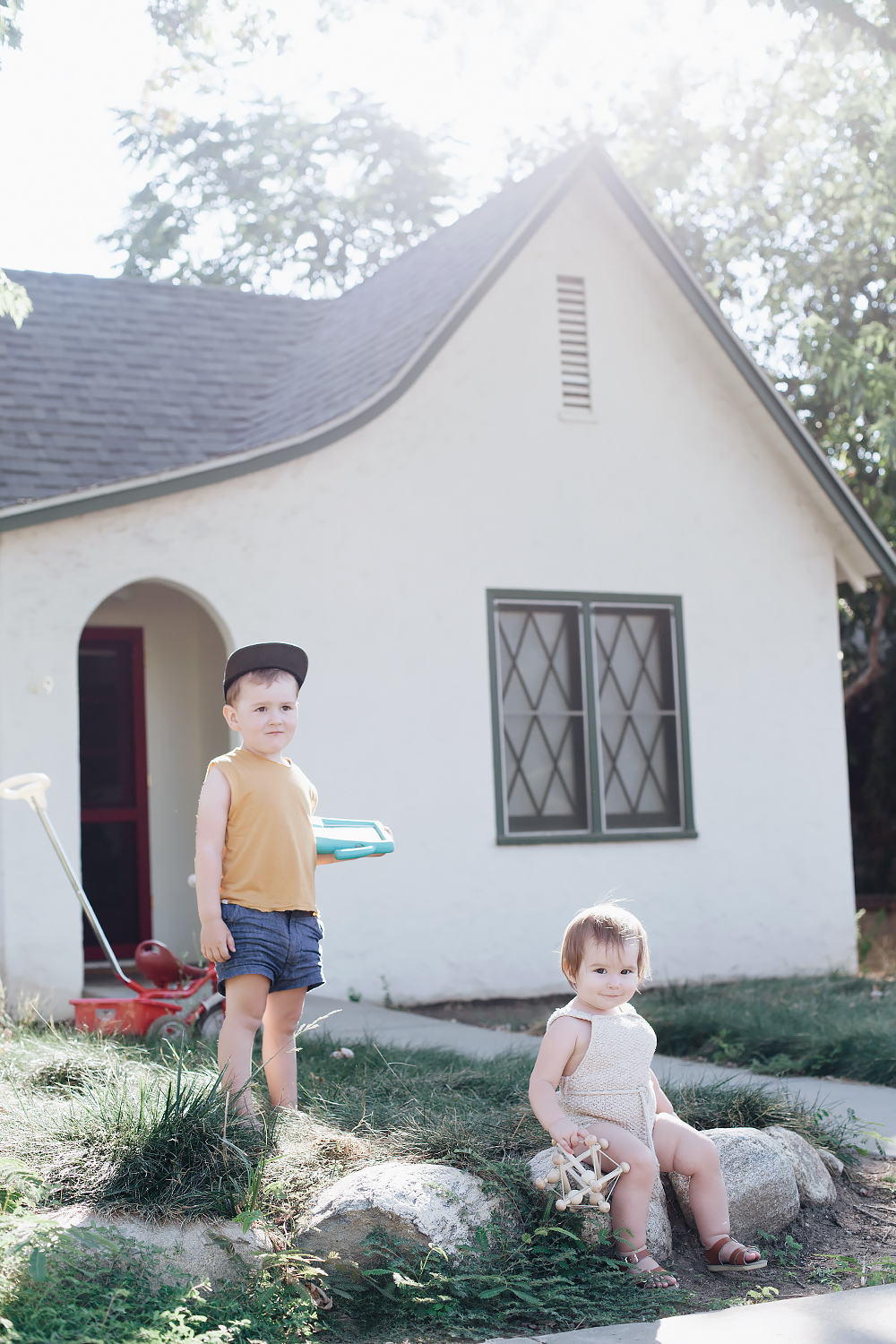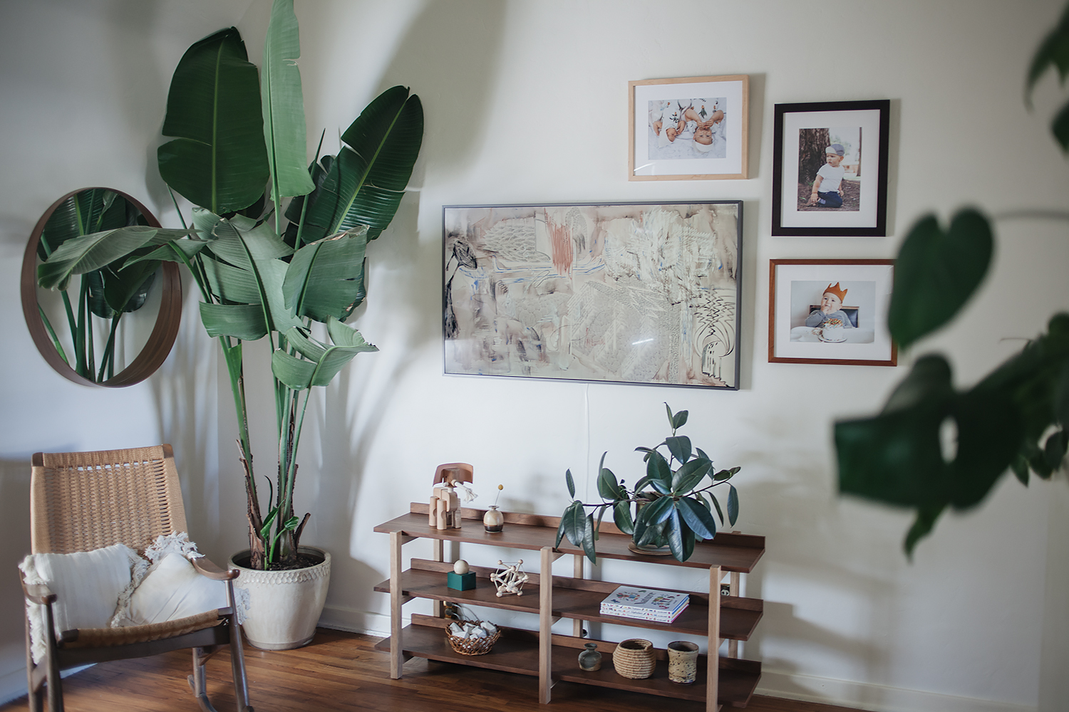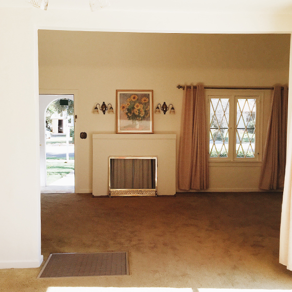
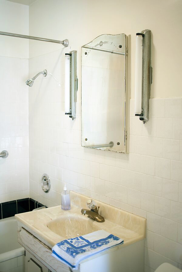
Since our one really big renovation last year, I haven’t had a whole lot to share about the house. We’ve mostly just been enjoying the space and keeping things mellow. But the one space we haven’t been enjoying? THE BATHROOM. It was the one really big, glaring project that didn’t get done last year despite the fact that our little vanity was literally falling apart, our bathtub was pitted beyond belief, and the window was… well, nonexistent. Our house was built in 1927 and even though it may be small, it’s always been big on charm. Except for the bathroom. And we only have one bathroom in the house! It had one unfortunate remodel somewhere around 1967 in which almost all of the original vintage features were removed and all that was left was a very hideous faux marble (?) sink and the persistent smell of old people. Literally. No matter how many times we cleaned, you’d always get the strongest waft of powdery perfume and mildew when you opened the cabinet door or the medicine cabinet. No, we weren’t living in squalor, but it was definitely creepy. A gross. And time for a change.
It’s always been my dream to restore this little house to it’s former 1920s glory. And I’ve always had some pretty strong ideas about what I’d like to do with the bathroom. I did a ton of research on vintage bathrooms from the time period and really wanted to go as historically accurate as possible while still, of course, acknowledging that we do live in modern times. I could write an entire post dedicated purely to all of the little details (and I probably will), but it’s not nearly as much fun as talking about (drumroll, please…) PAINT. I’m not kidding! It’s so funny, but of all the decisions that I had to make about this little bathroom, the paint color was definitely the most debated topic. For those of you who followed along on my Instagram stories, you’ll know what I’m talking about!
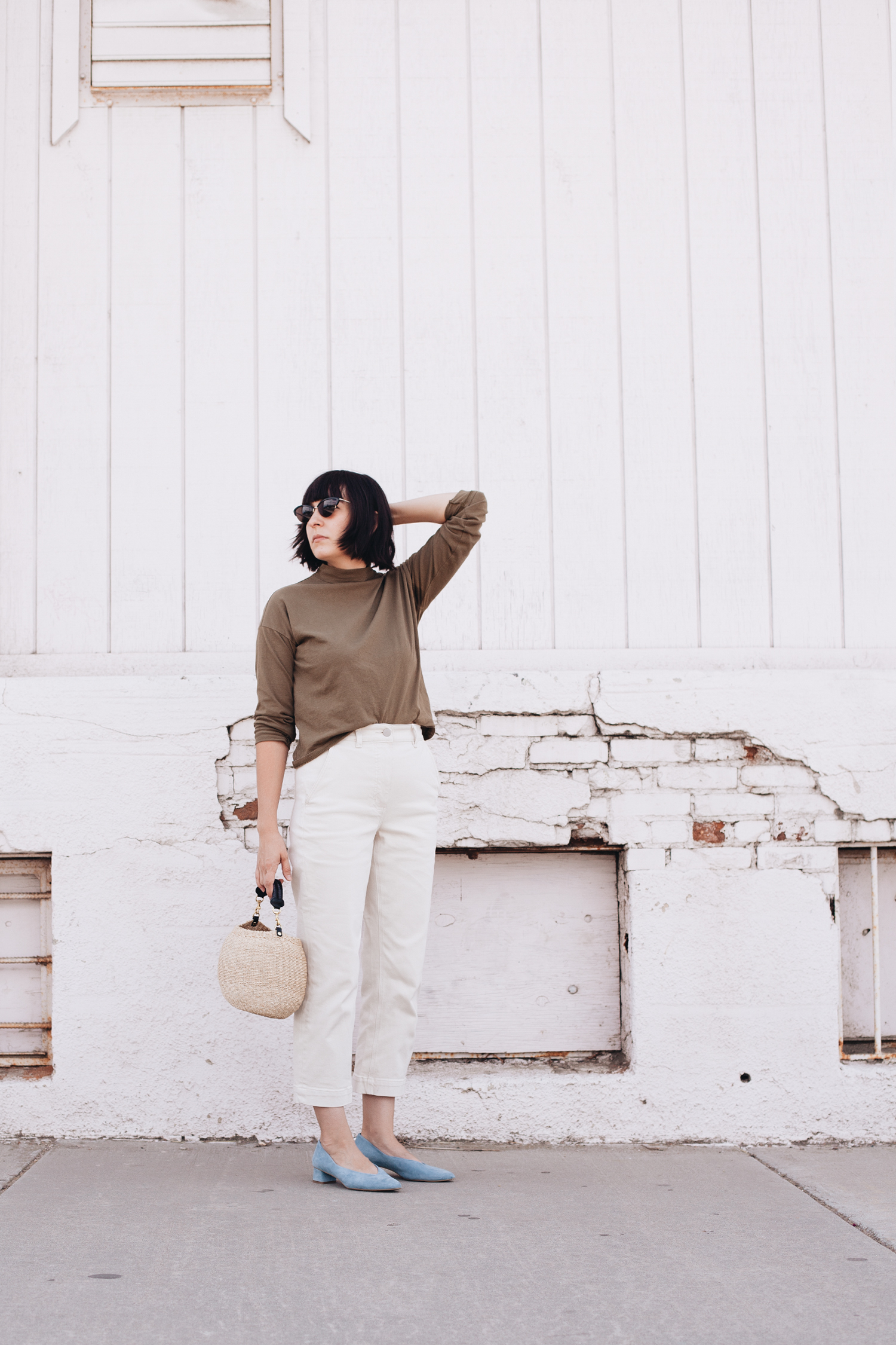
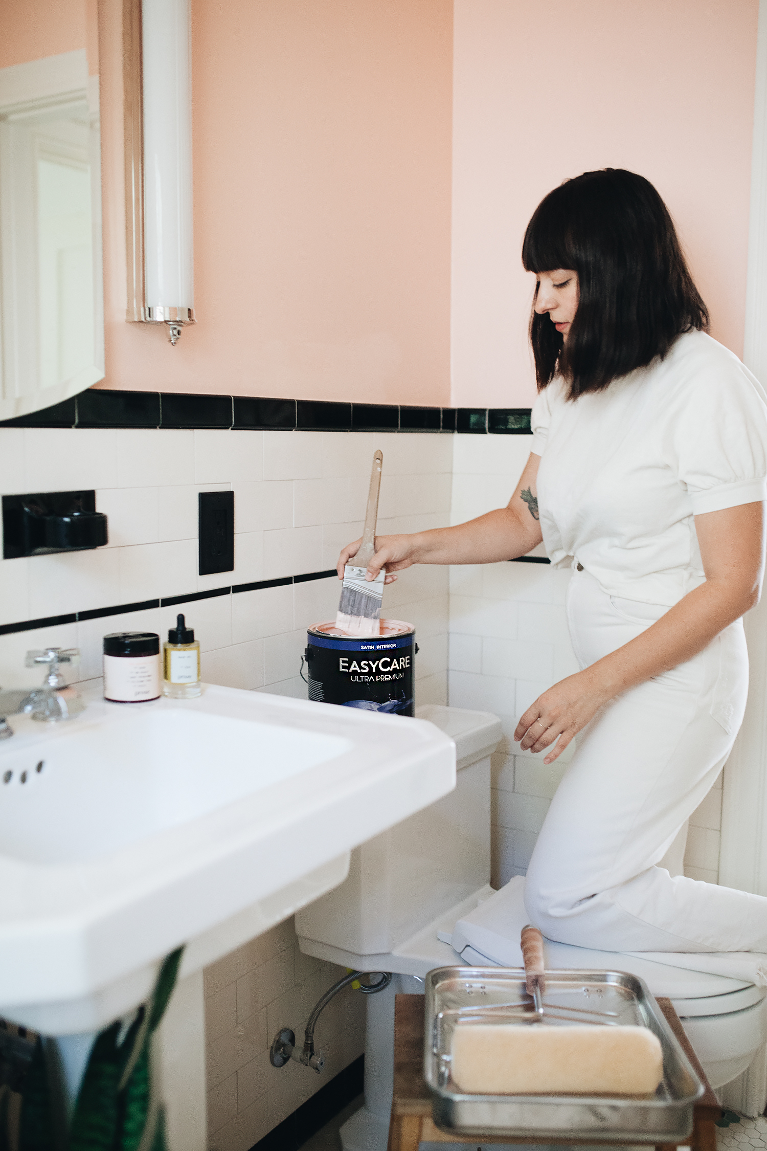
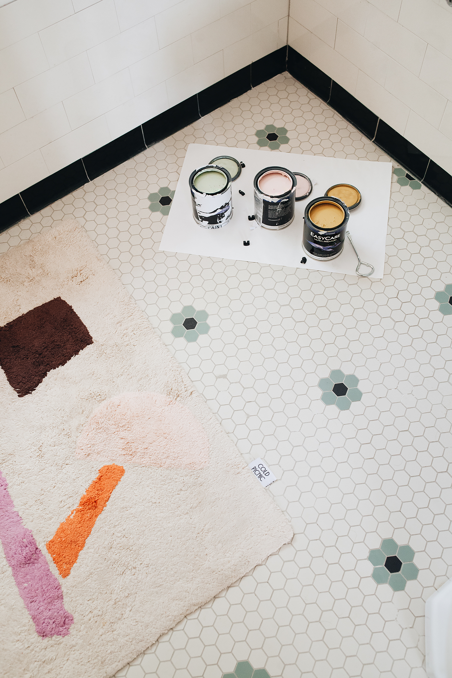
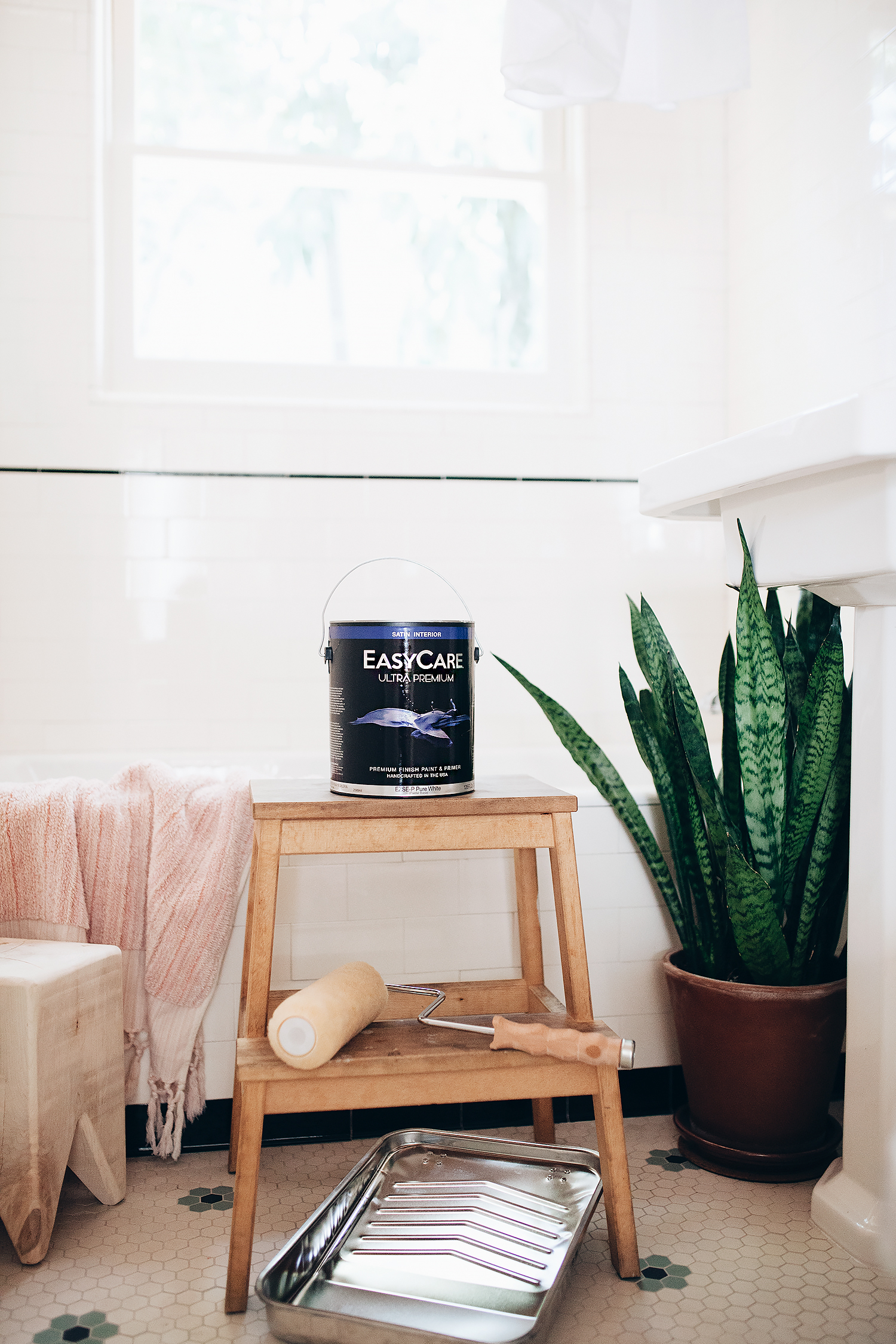
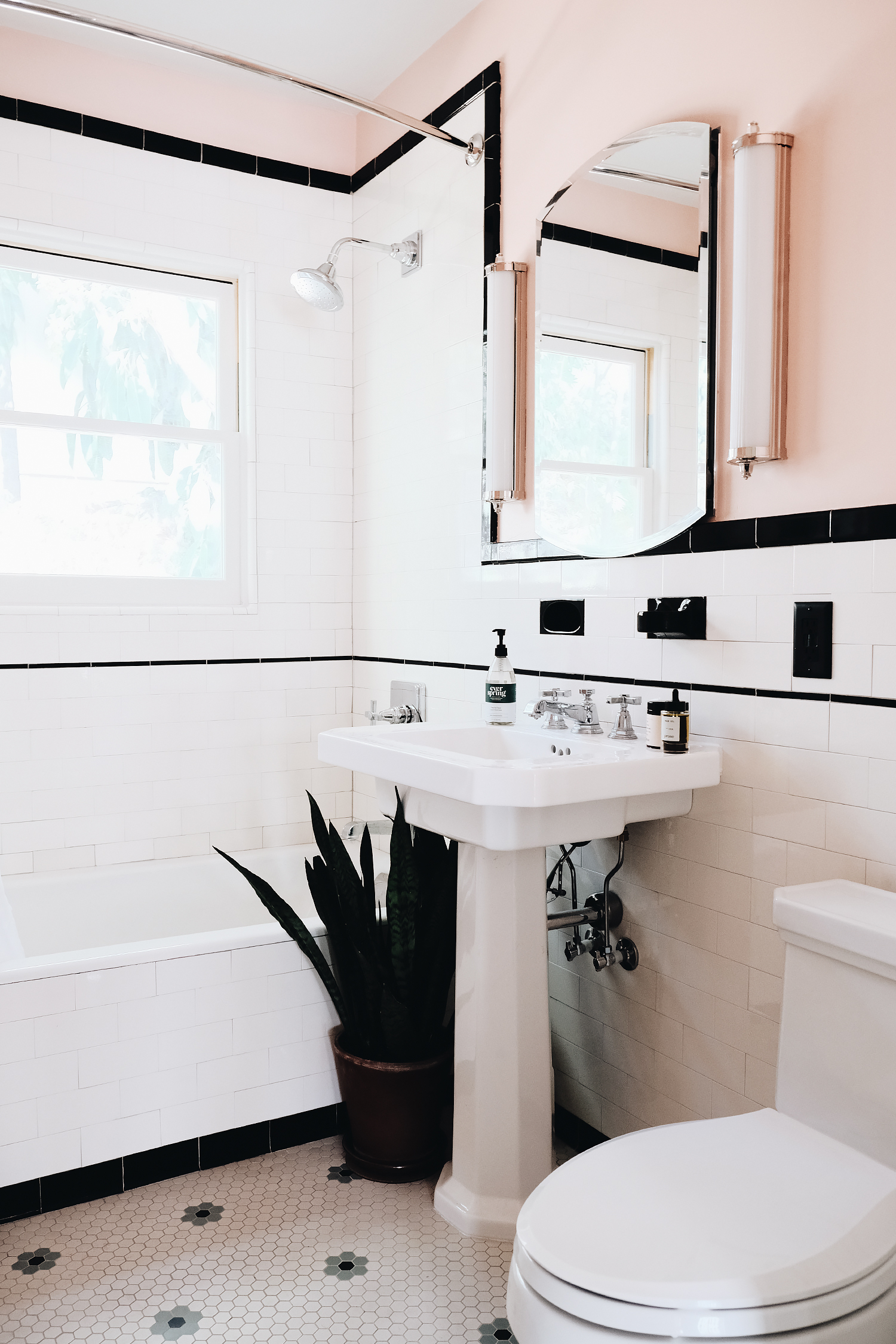
The bathroom itself is fairly simple. I went with an antique white subway tile and black accent details with just a little splash of green in the daisy pattern mosaic tiles on the floor, so we started with a nearly neutral base. I really enjoy designing this way because it means you really can’t go wrong with just about any color palette you choose for decorating. And even though changing the paint color is a lot easier than pulling out all of your tiles, it still manages to become one of the hardest decisions to make! Perhaps because it’s one of those final decisions. The color that finishes off the design and really pulls the room together. After comparing various brands, I decided to work with True Value’s EasyCare Ultra Premium Paint, which is known for their long lasting and superior products! I was quickly able to narrow it down to three options: a bold mustard (EasyCare Paint SUNBATH), a unique green (EasyCare Paint PARSLEY ROOT), and a soft pink (EasyCare Paint ROSE QUARTZ). Despite being my favorite color of the bunch, I could tell as soon as I swatched the mustard that it wasn’t going to work for the tiny space. Still, you always have to try something really out-of-the box because you never know until you get it up on the walls. But then it came down to team green vs. team pink. Do I echo the color of the floor tiles on the walls? Or do a bit of complimentary pink to balance it out?
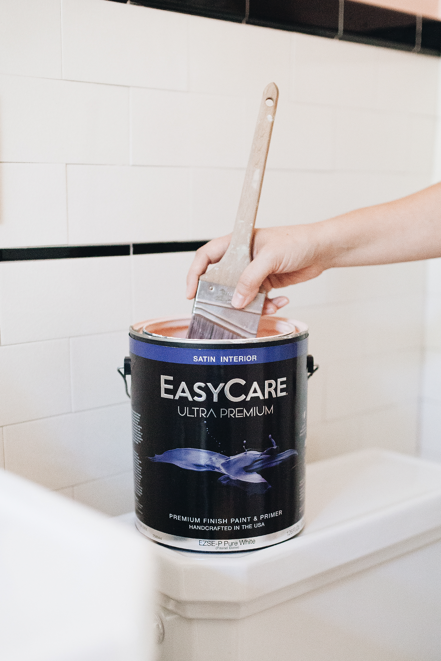
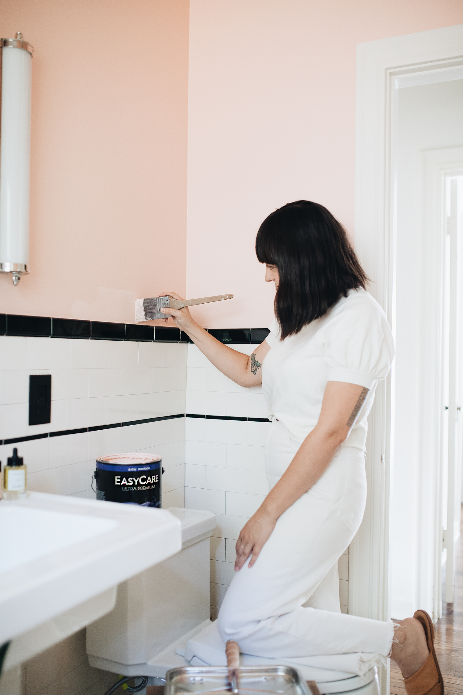
In the end, I went with my gut. The kids were both taking a bath and singing and playing. I sat there watching them with three little swatches painted on the wall above them and just chose what jumped out at me in that very moment. Something about the pink just felt so fun and cheerful for a period bathroom. Using the EasyCare Paint Color Gallery, I explored the pink options and in the end, I landed on THE COLOR: EasyCare Paint GLEE, in the Interior Satin finish. (Also available in flat, eggshell, semi-gloss, and gloss sheens for both interior and exterior applications, btw.)
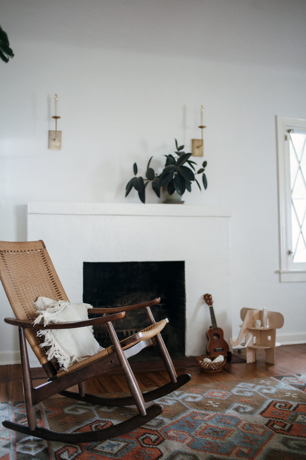
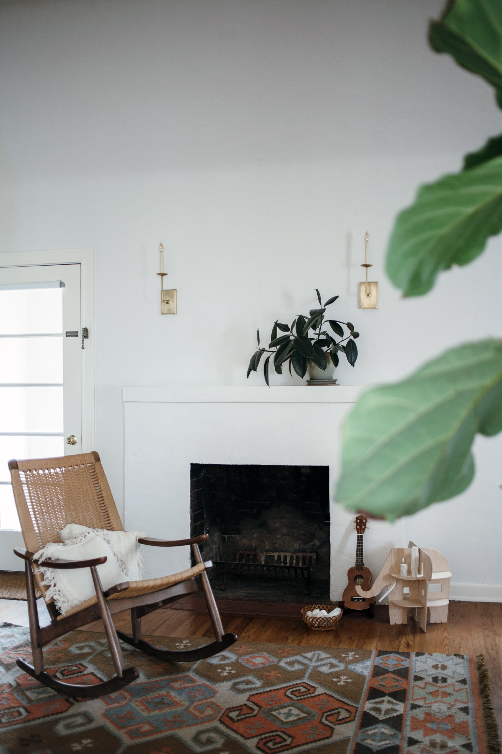
I’ve been a fan of EasyCare Paint since I worked with the brand to find the perfect neutral yet complex white for our living room and fireplace. It’s become my go-to paint around the house, so I was really excited about this project because I knew I wanted to have some fun playing with COLOR. And it’s super easy to use because it’s a paint-and-primer in one that offers durability, smooth application, impeccable finish, and rich color. It has superior stain resistance and delivers long lasting color and performance which is especially important for a bathroom that has to endure tons of moisture and plenty of wear and tear, particularly when you’ve got two little kids! And most importantly for them, it’s low-odor, low-VOC, and certified by the Asthma and Allergy Foundation of America. It minimizes irritants and pollutants in the air, creating a healthier indoor environment for your whole family in a range of colors to suit literally everyone. Picking a color is literally the hardest part, and they even make that easy.
Available at True Value stores nationwide and many independent paint and hardware retailers. Visit the Store Locator on EasyCarePaint.com to find a retailer near you.
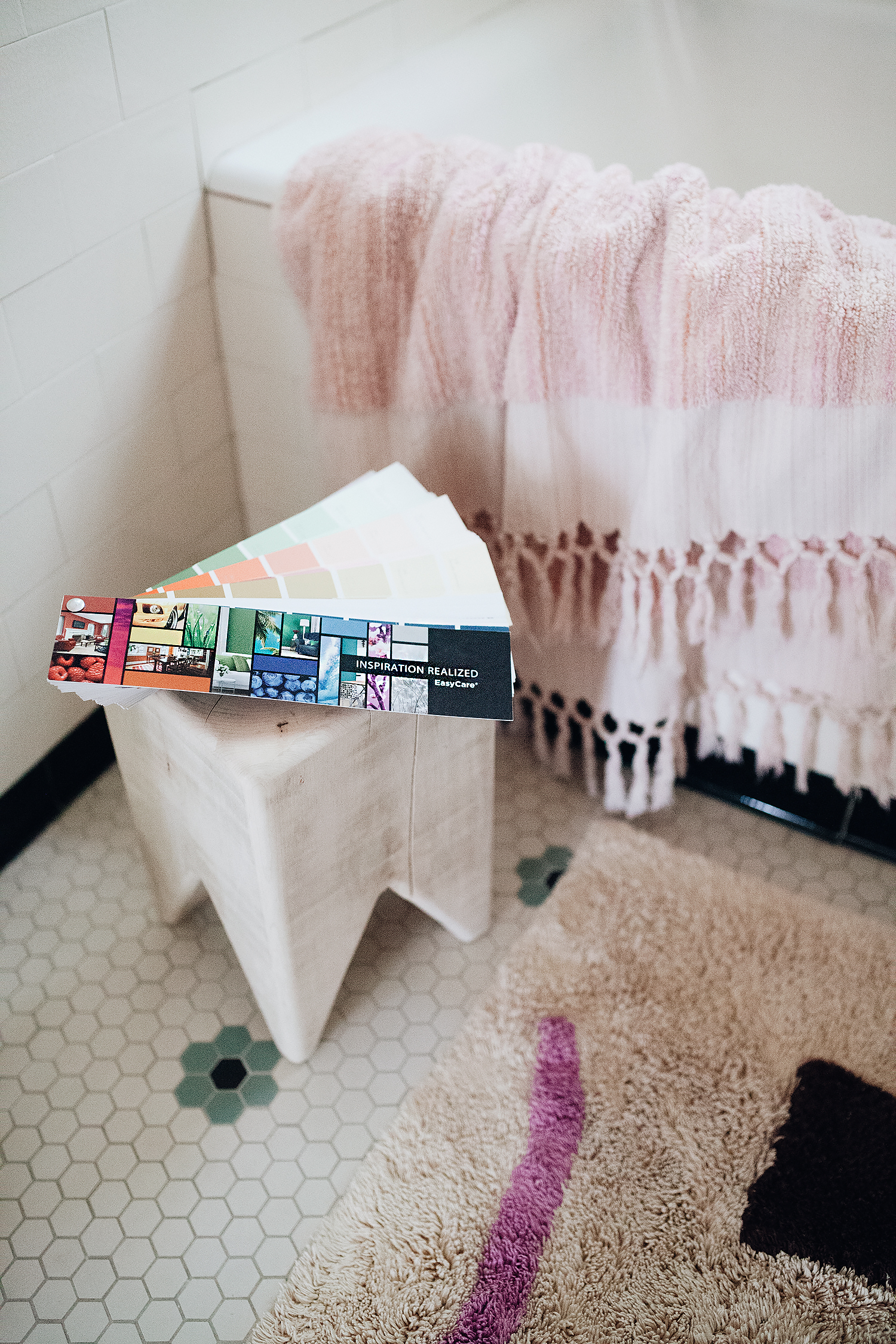
I used the fan deck to get an idea of what colors to swatch, comparing against some of the tile and decor
Ready to sample swatches!
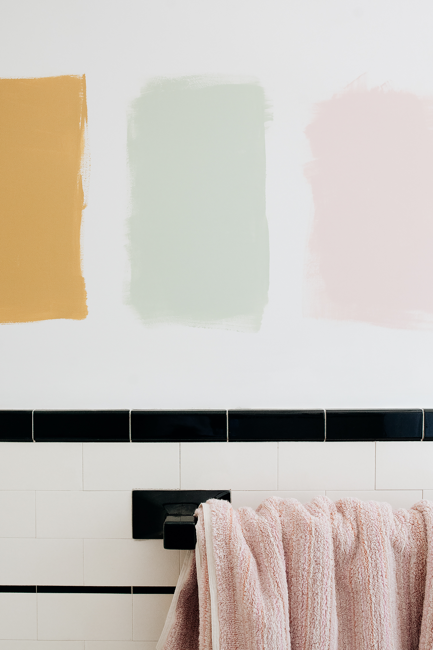
Are you team mustard, team green, or team pink?
Drumroll, please…

Just doing the final touch-ups to the room with the winning shade: EasyCare Paint GLEE
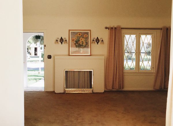
THE BEFORE:
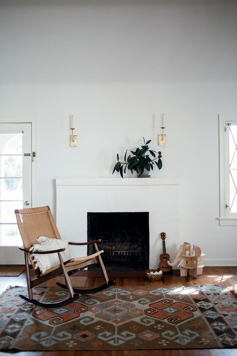
AND AFTER:
This post was sponsored by True Value and EasyCare Paint.